This assignment demonstrates your prerequisite knowledge by applying HTML, CSS, and JavaScript to the design and
development of your course home page.
Task
Design and develop your page using the following example as a guide for the layout and content.
The page must be meet course standards, be responsive, and pass
accessibility, best
practice, and SEO tests from DevTools Lighthouse audits.
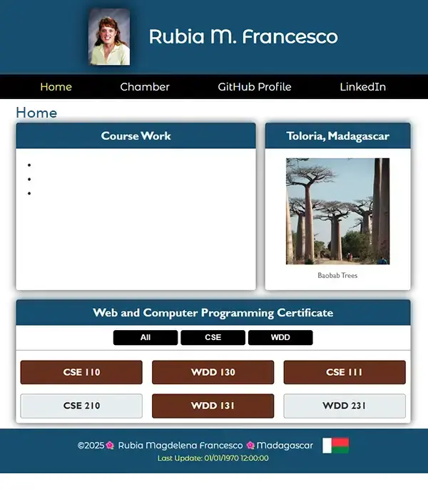
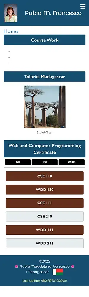
ScreenshotsExample Home Page – DesktopExample Home Page – Mobile
Instructions
File and Folder Setup
In VS Code, open your wdd231 folder that you cloned from your GitHub account during the Setup: Hosting on GitHub activity.
Create a default home page for this repository so that when published to GitHub, will render at
https://yourgithubusername.github.io/wdd231. What must this file be named?
Check Your Understanding
index.html
Create appropriately named, supporting folders for images, CSS, and JavaScript files.
These subfolders must be placed in the root directory, wdd231.
Check Your Understanding
Images will be stored in a folder named images
CSS files will be stored in a folder named styles
JavaScript files will be stored in a folder named scripts
Note that the words directory and folder have essentially the same
meaning. Directory is the more accurate term for file systems while "folder" 📂 refers to the graphical
metaphor that is generally accepted because it is highly related to the term "file" in the organized world.
Add CSS files as needed. You are required to write your own custom CSS in this course. Frameworks and
libraries are
not allowed. The assignment requires you to create a responsive layout for all screen widths
from (320px) and up. For
this class, you may use a normalize CSS file. The class requires you to use a small.css followed by a larger.css
file. The larger css file
must contain a media query.
Add multiple JavaScript files as needed. For example, create files to support the responsive navigation
(navigation.js), dates (date.js), and course information cards (course.js). Reference these in the
head using the defer
attribute method. As you move through this course, you will need to add additional JS files. Only load the files
for each page that are needed for that page.
HTML
Add the standard HTML document structure to the document.
Add the required elements to the <head> including the title,
meta description, and the meta author.
Use semantic HTML to create the basic layout structure of the page. Use a
header, a nav, a main, and a footer element.
Add the content as shown in the example screenshots above.
Note that all images used on your pages must be optimized.
In this class, the image memory size threshold is 125 kB or less per image.
The <header> tag should contain a site logo (using an svg file) and your name rendered
using a <span> tag, and a hamburger icon on small screens.
The responsive navigation <nav> menu contains three links:
Home – this current page.
Chamber – will link to the Chamber of Commerce website project (week 2).
Final – will link to the Final project (week 6).
The <main> element contains the following:
The heading "Home" rendered using an <h1> tag.
Three <section> tags with headings <h2> as shown in the example
screenshots above.
The <footer> has three items.
The first item is a series of social media links including GitHub and Linked In and one or two others that
you choose. These icons should link to your GitHub repository and your Linked In account.
The next item contains the following:
the copyright symbol and current year that are written dynamically using JavaScript
Check Your Understanding
In HTML, provide a placeholder that can easily be selected using JavaScript.
Example: <span id="currentyear"></span>
your name
your state or country
The third item displays the date the page was last modified using JavaScript. This could be a paragraph
that has an id of "lastModified".
CSS
As you style and layout your page, ensure that the following, required web design principles
and best design practices are met.
Appropriate proximity, alignment, repetition, and
contrast design principles are used.
There is no horizontal scrolling in views between 320px to 1200px wide.
Text does not touch the edge of the screen causing a visual tangent error.
Any text overlays on images, other elements, or other text/content is legible and does not overflow in
smaller views.
That there is no twitching in the navigation on hover.
Images are not squished nor distorted as the page is resized.
Images are not oversized causing pixelation.
Use your own color scheme and typography choices.
Use the Google Fonts API
to select one font family to use on this page. We covered this in week 1 of
WDD131 if you need
to review Google Fonts
Responsive navigation must support the following features:
Responsive design includes providing a positive user experience of readability,
usability, accessibility, visual appeal that adapts to
the user's device by size, orientation, and resolution.
Your design cannot just be a simple one column layout (default flow layout) in all views in order to warrant
full credit consideration.
JavaScript
Use external JavaScript files. (No inline/embedded JavaScript code is allowed in the HTML document.)
Place the js JavaScript files in the scripts subfolder.
Reference JavaScript files by using a <script> reference
in the head of the HTML file and using the attribute defer. When you are using type="module", the defer attribute is not necessary.
Modify the courses array content in your script file by changing the
completed property to true if you have completed a course.
Dynamically display all the courses in the certificate section as shown in the example above. The courses that
you have completed must be marked in a different way versus those that you have not completed. Use your page
color scheme. The page should adjust automatically if the data source changes.
Using buttons that listen for the click event, allow the user to select to display All
Courses, WDD Courses, or CSE Courses. Hint: Use the array
filter method.
Demonstration of User Interface Filtering Course Output
Design the course cards to indicate those courses that you have completed personally in a
complimentary, but different style than the rest, indicating course completion.
Provide a total number of credits required dynamically by using a reduce
function (not shown on the screenshots). The number of credits shown should reflect just the courses currently
being displayed.
Testing
Continuously check your work by having it loaded in your browser using Local Server.
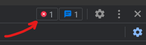
Use the browser's DevTools to check for JavaScript runtime errors in the console or click the red,
error icon in the upper right corner of DevTools.
"DevTools" is an abbreviation for the browser's "Developer Tools." It refers to a set of tools or utilities
provided by web browsers to help developers debug, profile, and analyze web pages during the development
process. The tools are typically accessed by pressing the F12 function key or selecting the menu option for
the browser's developer tools.
Use DevTools
CSS
Overview
to check your color contrast.
Generate the DevTools Lighthouse report and run diagnostics for
Accessibility,
Best Practices, and SEO in both the mobile and Desktop views.
Use the Private or Incognito mode to test your page
when using Lighthouse. The standard is to reach a score of 95+ in each of these categories.
Submission and Audit
Commit and sync your local work to your a GitHub Pages enabled wdd231 repository
Use this ☑️ audit tool
to self-check your work for some of the required HTML elements and CSS content. This audit tool is also used by
the assessment team.
Return to Canvas and submit your GitHub Pages enabled URL for wdd231, e.g.,
https://username.github.io/wdd231
Do not need to include index.html in the URL reference because index.html is the default
file retrieved with a folder request on GitHub Pages.
 "DevTools" is an abbreviation for the browser's "Developer Tools." It refers to a set of tools or utilities provided by web browsers to help developers debug, profile, and analyze web pages during the development process. The tools are typically accessed by pressing the F12 function key or selecting the menu option for the browser's developer tools.