The Website Planning Document
Overview
Developing a site plan is a critical step in any web design and development project. Site plans help establish the purpose of the site, the targeted message, and the overall look and feel. The plan provides a framework to apply consistently across a site's pages. It is a blueprint from which to design and develop.
Typically you will heavily involve stakeholders or clients in the planning process as you ask questions and develop scenarios which target a specific audience and meet the website's objectives.
Prepare
Site Plan Outline
Site plans come in many shapes and sizes and in varying levels of detail. Here is a list of common elements in a site plan.
- Statement of purpose and goals
- Definition of the target audience
- Personas and scenarios (who will use the site and how will they use it?)
- A style guide
- Branding Information (how to correctly use the branding for the site)
- Typography choices and justification
- Color palette
- Specific styling of elements on the site (headings, lists, paragraphs, forms, links, buttons, and so on)
- A site map
- Wireframes showing general layout and content areas for major pages
Purpose Statement
From the beginning, websites have always been about displaying content. This is the underlying purpose behind every site on the Internet, or at least it should be. In order to determine which content or functionality you should put on the site, it is critical to determine the site's purpose. The content should support that purpose. At a high level these purposes can take many forms:
- Build revenue for a new or existing business
- Share information for business or educational purposes
- Share opinions on a subject
- Share personal interests with family and friends
All websites should have a purpose, and that purpose should be more than "My teacher is making me do this". The purpose needs to be defined by the client and stakeholders and not the site developer. For this course's whitewater rafting project, you will need to imagine that you are the owner of the rafting business and have decided that it is time to have an online presence.
Target Audience Statement
Websites are all about content. The site's purpose helps define what content you should include, and the content should target your specific audience or audiences (websites can have more than audience). Some questions and scenarios that can help drive decisions about site content include:
- Who are the target customers? Describe their life (or business) situation, such as their age, financial situation, interests, etc.
- What do they want?
- What do they expect to find or what questions will be answered by them accessing the website?
- What are their needs that aren't being met?
- How will my audience usually access my site (desktop, laptop, mobile device)?
The Style Guide
Color Palette
Color plays an essential role in any website, and so you will choose the colors deliberately. The following video will teach you some lessons about color theory and can help you with your color choices.
Video: ▶️ Beginning Graphic Design: Color
Using the coolors.co tool, explore the five color palettes stripes. When you hover ovr a color the following four items appear: Alternative Shades, Drag, Adjust, and Lock. Play around with one color until you end up with something you like. You will use this tool to choose the color schema of your rafting project this week. You can hit the space bar on your keyboard to generate different complementary color schemes for the color you chose. Feel free to lock other colors and generate until you end up with 3 to 4 colors that you wish to use on your rafting site.
Fonts / Typography
After the colors you choose, fonts have the next largest (or even larger in some cases) impact on a site's look and feel. The following video shares some important lessons about fonts.
Watch: ▶️ Beginning Graphic Design: Typography
Read: CSS Fonts – This article provides a video demonstration of applying CSS font declarations and an example of how to use Google Fonts.
Example Style Guide
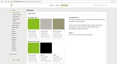
Open the FamilySearch style guide example to get a better idea about how a site plan might be put together.
Note: the FamilySearch style guide is not exactly a site plan, but it does have similar purposes and content to the site plan that you will create in this class.


A Site Map
The site map provides a graphic view of the hierarchy, navigation, and relationship between the pages on a website. The site map is typically a sketch of all the pages and references on the site and is derived from the customer's functional specifications. The hierarchical relationship is illustrated and will drive the site navigation and links. Depending on the project, these site maps can be complex. Given the relatively small size of this course's rafting site project, you will likely not draw up a site map.
Do not confuse the visual site map section of the website planning document with a XML sitemap file that lists a website's URLs for search engines like Google, Bing, etc., to help them crawl and index the website's pages more efficiently.
Wireframes
Wireframes are a visual representation of the layout of a web page. They are typically used to show the placement of elements on a page and how they relate to each other. Wireframes can be simple sketches or more detailed mockups, depending on the needs of the project. The wireframe is a critical step in the design process, as it helps to ensure that all stakeholders have a clear understanding of the layout and functionality of the site.
Activity Instructions
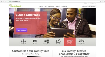
Consider the purpose and audience of the FamilySearch site. Ponder the following questions and statements about the FamilySearch site.
- Do you think the current hero image used on the main page of FamilySearch is effective or not? Why?
- Does the site accomplish the purpose well and cater to its audience?
- Consider the main menu. Why were these topics and words selected for the main menu? Are there any sub-menu items that are phrased as questions?
- In the FamilySearchTM
Style
Guide, select the Colors menu and review the
Logo Colors. Compare these colors with the FamilySearch Logo and note the
application. Do you have any color
contrast concerns?

- In the FamilySearch Style Guide, select the Typography menu (left hand side of page) and read through the directives of use and avoidance. What is the accessibility purpose of HTML headings(see Usage Notes)?
