
CSS Global Styling and Tailwind CSS
Overview

CSS global styles are applied across your entire application instead of being scoped to one component. This creates a consistent visual foundation for your site. In this activity, you will learn how global styles work in Next.js and how Tailwind CSS utility classes help you build and style components quickly with a consistent design system.
Given that you have completed a significant amount of prerequisite coursework using CSS, learning to leverage a framework like Tailwind CSS can significantly speed up your development process and improve consistency. It does obscure why things look the way they do, but it also makes it easier to maintain and update your styles.
Prepare
Global Styles
Global styles in Next.js can be defined in the app/globals.css file. This file contains styles that are applied to the entire application, ensuring a consistent look and feel across all pages and components.
In the Next.js App Router, the app/globals.css file should be imported in the root layout (app/layout.tsx). The root layout is the top-most layout in the root app directory and is used to define the <html> and <body> elements and other global elements.
To import the global styles, add the following line to the top of your app/layout.tsx file:
import './globals.css';Once imported, the styles defined in globals.css will be applied to all components and pages in the application. This allows you to define base styles, typography, colors, and other design elements that will be consistent throughout your site.
Tailwind CSS
Tailwind CSS is a utility-first CSS framework that provides a set of pre-designed classes that can be combined to create custom designs quickly. It allows you to build responsive websites without writing custom CSS from scratch.
To use Tailwind CSS in your Next.js application, you need to install it and configure it properly. Last week you learned how to set up Tailwind CSS in your Next.js project during the Next.js setup process.
For example, adding a blue background color that is bold, white text, and padding to an h1 element could look like this:
<h1 className="bg-blue-700 text-white p-4">Simple Tailwind CSS Example</h1>In this example, Tailwind utilities map directly to concrete CSS rules: bg-blue-700 applies background-color: rgb(29 78 216 / 100%);, text-white applies color: rgb(255 255 255 / 100%);, and p-4 applies padding: 1rem; (16px).
CSS styles are shared globally across your application. Each class is isolated to the component where it is defined. This means if an element is added or modified, the changes will only affect that specific component and not the entire application. There is no need to maintain separate stylesheets, and the size of the CSS bundle will not grow as the application scales.
Do not try to memorize all the Tailwind CSS classes. Instead, focus on understanding the utility-first approach and how to combine classes to achieve the desired styles.
💡Use AI to assist you with the Tailwind class syntax.
Conditional Classes with clsx
When class names become long or depend on state, the clsx library can make your code easier to read. It is a common pattern in production React and Next.js apps.
Install it in your project:
npm install clsxExample of conditionally applied Tailwind classes based on status where status is a string of pending or paid:
import clsx from 'clsx';

export default function InvoiceStatus({ status }: { status: string }) {
  return (
    <span
      className={clsx(
        'inline-flex items-center rounded-full px-2 py-1 text-sm',
        {
          'bg-gray-100 text-gray-500': status === 'pending',
          'bg-green-500 text-white': status === 'paid',
        },
      )}
    >
      {status}
    </span>
  );
}clsx(...)combines always-on classes (the first parameter) with conditional classes (the second parameter in {}).- The object keys are class strings; the values are boolean conditions.
- This keeps your JSX cleaner than long nested ternary expressions inside
className.
Activity Instructions
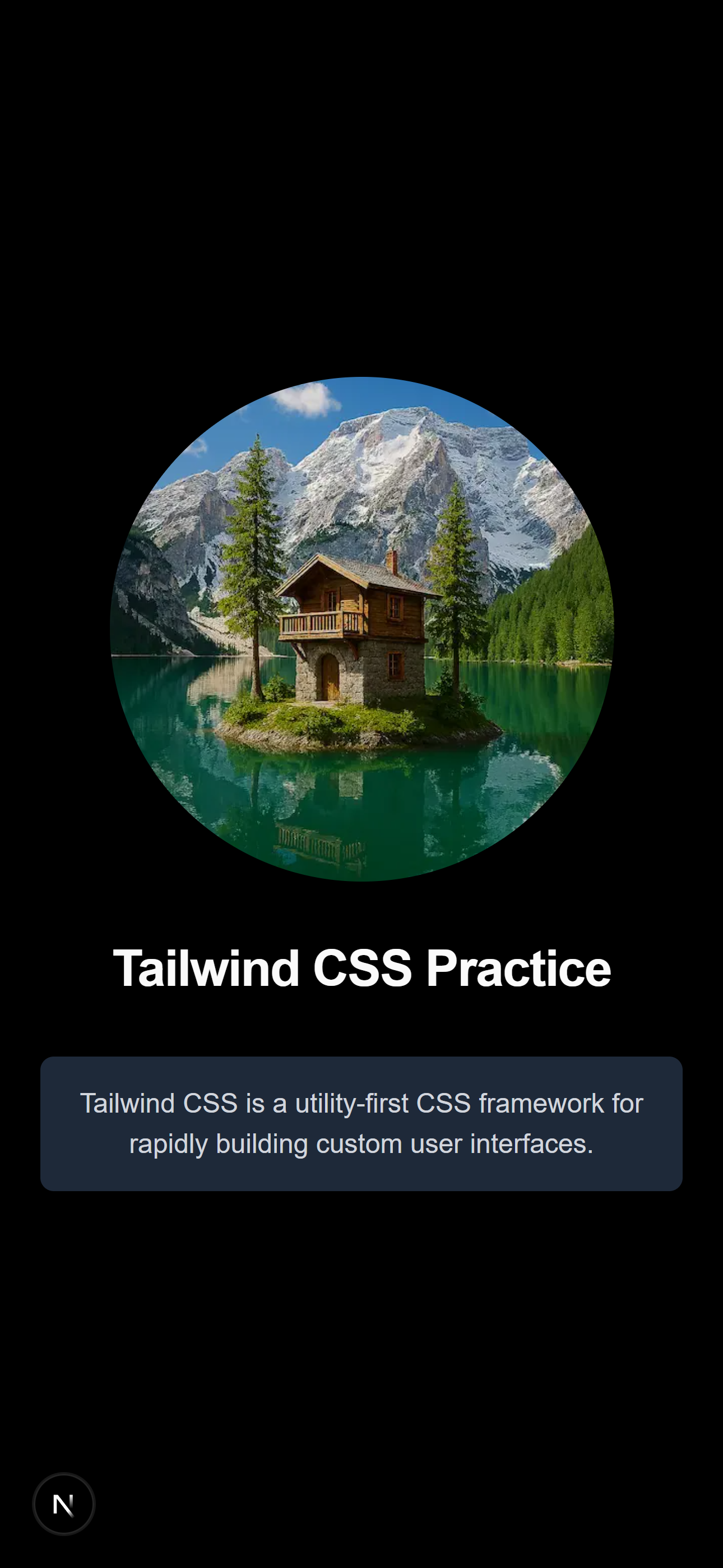
In this activity, you will build a styled profile card page using global styles and Tailwind CSS utility classes to match the output shown here on the right.
Setup — create-next-app
- Create a dedicated practice folder named w02-tailwind-styling and scaffold the Next.js project inside it:
mkdir w02-tailwind-styling
cd w02-tailwind-styling
npx create-next-app@latest . --typescript --tailwind --app
These flags automatically configure TypeScript, Tailwind CSS, and the App Router directory structure. This is a standalone practice project, not a subfolder of another repository.
Go ahead and accept the default prompts for any remaining options.
- Navigate into the tailwind-styling project directory and start the development server.
cd tailwind-styling
npm run dev
Open http://localhost:3000 in your browser. You should see the default Next.js welcome page – you will replace this default content in the next steps.
- Review the files found in the app/ directory. You should see favicon.ico, globals.css, layout.tsx, and page.tsx.
Global Styles and Tailwind CSS
- Open the app/globals.css CSS file for editing.
- By default, this file will contain some at-rules and initial styles for the body selector.
The
@import "tailwindcss"at-rule imports the Tailwind CSS framework.The
:rootselector defines CSS variables for the entire document.The
@themeat-rule defines design tokens, like colors and fonts, as CSS variables for consistent styling across your app.The
@mediaat-rule applies styles conditionally based on device characteristics like screen width, color scheme, or orientation. - Set the global rule for
htmldocuments by setting thefont-sizeproperty. - Add a brand color variable to the
:rootblock in globals.css::root { --color-brand: #4f46e5; }Then temporarily apply it to confirm it works:
body {
  color: var(--color-brand);
}
Save and check the browser — your text should change color. Remove the
bodyrule afterwards. This step demonstrates native CSS variable usage only; at this point Tailwind utility classes liketext-brandare not yet generated. - Add a global link style using Tailwind's
@layer basedirective:@layer base { a { @apply text-indigo-600 underline; } }The
@layer basedirective lets you write CSS that participates in Tailwind's cascade ordering. The@applydirective pulls in Tailwind utilities as plain CSS rules, applying them globally to all matching elements — just like a traditional CSS reset.Use
@layer basefor element-level defaults (headings, links, body text). Use@layer componentsfor reusable patterns you want to apply via a class name. - Extend the
@themeblock to register your brand color as a Tailwind utility:You will use the same token name from the previous step on purpose. Defining
--color-brandinside@themeis what tells Tailwind to generate utility classes such astext-brandandbg-brand.@theme { --color-brand: #4f46e5; }Now use it directly in JSX as a Tailwind class:
<h1 className="text-brand">Your Name</h1>Tailwind automatically generates utilities like
text-brand,bg-brand, andborder-brandfrom any--color-*variable defined in@theme. This is how you extend Tailwind's design system without a separate config file. - Open the browser Developer Tools and find the generated CSS file. Observe that Tailwind only includes styles for the utility classes actually used in your project — no unused classes are generated.
This on-demand approach is what keeps Tailwind's production CSS bundle small even though the framework contains thousands of possible utilities. Each class you add to your JSX generates exactly the CSS it maps to — nothing more.
Root Layout and Page Build
- Open app/layout.tsx and confirm that
globals.csswas automatically added. Because it is in the root layout, your global styles apply to every page in the application.import './globals.css'; - Review the
function RootLayout()function. - Open app/page.tsx and remove all the existing content within the
mainelement. - Add an
Imageelement inside the existingmainelement (any appropriate image is OK to use). You will need to save that image in the public/ folder at the root of the project. Verify and update the values as needed for the props of theImagecomponent includingsrc,alt,width,height, andpriority. - Add a heading with "Tailwind CSS Practice" as the content.
- Add a paragraph with a brief description of Tailwind CSS.
- Use Tailwind CSS utility classes to style each element and match the screenshot above.
Let AI help you develop the styling you need to match the screenshot.
- Use AI to suggest additional Tailwind classes to further refine your page. Describe what you want in plain English, for example:
- "How do I vertically and horizontally center all my content in the full viewport height?"
- "What Tailwind classes give an image a subtle hover zoom effect?"
- Use the browser's Developer Tools to inspect the generated CSS. This is one of the best ways to build your mental model of how utility classes map to CSS.