
W01 Assignment: My First Next.js App
Overview
This assignment provides a hands-on experience building your first Next.js application and deploying it. You will create a simple portfolio site using Next.js's modern App Router, strengthening your understanding of file-based routing, server components, and component composition.
Instructions
Create a new Next.js project
- Open your terminal in VS Code or your preferred terminal and create a local project folder named
wdd430-portfolio:
mkdir wdd430-portfolio cd wdd430-portfolio - Create a new Next.js project named wdd430-portfolio in the current folder:
This command will set up a new Next.js project with TypeScript, Tailwind CSS, and the App Router. You will be prompted to answer a few questions about your project setup. You may need to install the create-next-app package globally if you haven't already:npx create-next-app@latest . --typescript --tailwind --appnpm install -g create-next-app. - Answer the setup prompts with the recommended settings (see figure below):
- Linter: Select ESLint
- React Compiler: No
- Use src/ directory: No
- Use App Router: Yes
- Customize import alias (`@/*`): No
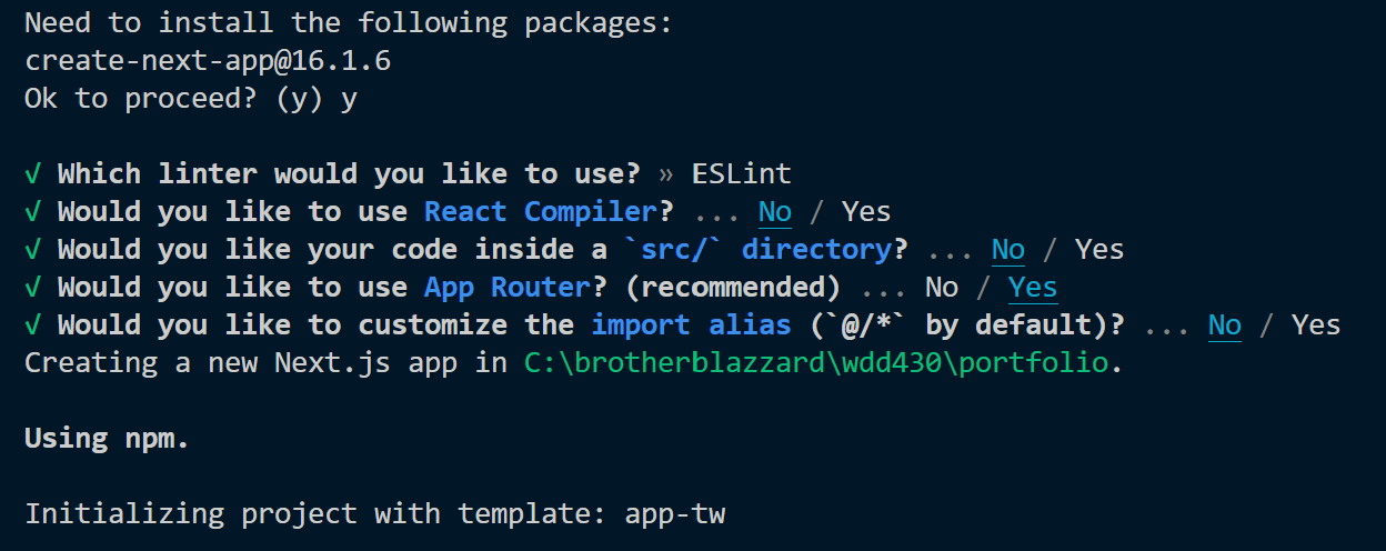
Settings for creating your Next.js app
Run the development server
- In your wdd430-portfolio folder, start the development server:
npm run dev - Open http://localhost:3000 in your browser to verify the app is running.

Initial Next.js application home page
Publish the project to GitHub after the initial build
- After confirming the app builds and runs, stop the dev server (using Ctrl+C or Cmd+C) and initialize git in
the terminal:
git init git add . git commit -m "Initial Next.js build" - Create an empty GitHub repository named wdd430-portfolio (no README/license), then connect
and push:
git branch -M main
git remote add origin https://github.com/your-username/wdd430-portfolio.git
git push -u origin main
Organize your project structure
You will notice that the project has a folder structure. We will add to this structure to support our portfolio site.
- Add the missing files and folders to your Next.js app to match this layout:
There are additional files in the default Next.js project build. Leave those files as they are.
wdd430-portfolio/ ├── app/ │ ├── favicon.ico (Default app icon 🔺) │ ├── globals.css (Global styles - Tailwind CSS imports) │ ├── layout.tsx (Root layout with navigation) │ ├── page.tsx (Home/Portfolio page) │ ├── about/ │ │ └── page.tsx (About page) │ └── api/ (a simple API route) │ └── hello/ │ └── route.ts ├── components/ │ ├── Header.tsx (Navigation header) │ ├── ProjectCard.tsx (Reusable project card) │ ├── ProjectList.tsx (Container for projects) │ └── Footer.tsx (Footer) ├── public/ └── package.json/app: Contains all the routes, components, and logic for the application./components: Contains reusable UI components./public: Static assets like images and icons.package.json: Project metadata and dependencies.- Config files: Configuration files like
tailwind.config.ts,tsconfig.json, and so on.
Remember to commit and push changes often to your GitHub repository.
Create reusable components
Build the following components found in the components/ folder. Accept props as needed and
demonstrate component composition.
- Header – Server Component that displays navigation links for Home and
About. Import the Next.js
Linkcomponent to support client-side navigation. Use JSX markup and Tailwind CSS utility classes for layout and styling.The following is an example Header component.
import Link from 'next/link';

export default function Header() {
  return (
    <header className="bg-blue-600 text-white py-4 shadow-md">
      <div id="header-title" className="text-2xl font-bold">Xavier Rodriguez</div>
      <nav className="max-w-4xl mx-auto px-4 flex justify-between items-center">
        <ul className="flex gap-6">
          <li><Link href="/">Home</Link></li>
          <li><Link href="/about">About</Link></li>
        </ul>
      </nav>
    </header>
  );
}
Example Header Component Notes
import Link from 'next/link'brings in Next.js navigation so route changes happen without full page reloads.export default function Header()defines a reusable component that can be imported.- The returned JSX uses semantic HTML elements:
headerfor page header structure,navfor navigation, and a list (ul/li) for menu links. classNameapplies Tailwind CSS utility classes for color, spacing, alignment, and sizing.The built-in Tailwind CSS class names may be unfamiliar to you, for example,
bg-blue-600,text-white,py-4, and so on. Copilot generally provides strong support Tailwind CSS classes. For example, you can leverage Copilot to do the following:- Generate utility-class combinations from clear, plain-language prompts.
- Refactor repeated class strings into reusable components or patterns.
- Explain what existing classes do and suggest alternatives.
- Explain the purpose of specific Tailwind CSS classes.
Always review AI generated suggestions before applying them to your code.
<Link href="/">and<Link href="/about">map to App Router pages atapp/page.tsxandapp/about/page.tsx.- Use Next.js
Linkfor internal routes in your app, and use an HTML<a>element for external URLs.
- ProjectCard – This component accepts props:
title,description,technologies, andlink.The following is an example ProjectCard component
interface ProjectCardProps {
  title: string;
  description: string;
  technologies: string[];
  link?: string;
}

export default function ProjectCard({title, description, technologies, link}: ProjectCardProps) {
  return (
    <article className="p-4 border-l-4 border-blue-600 bg-gray-50 rounded">
      <h3 className="text-xl font-bold mb-2">{title}</h3>
      <p className="text-gray-700 mb-3">{description}</p>
      <p className="text-sm text-gray-600">
        <strong>Technologies:</strong> {technologies.join(', ')}
      </p>
      {link && (
        <p className="mt-2">
          <a href={link} target="_blank" rel="noopener noreferrer" className="text-blue-600 hover:underline">View Project</a>
        </p>
      )}
    </article>
  );
}
Example ProjectCard Component Notes
- The
ProjectCardPropsinterface defines the expected props for the component, providing type safety and documentation. - The component uses destructuring to access props directly in the function parameters.
- Conditional rendering is used to only show the project link if a URL is provided.
- Use an HTML
<a>element for external URLs (like GitHub). Use Next.jsLinkfor internal routes within your app. - Tailwind CSS classes are applied for styling, including padding, borders, background color, and typography.
- This component can be reused for multiple projects by passing different prop values.
- The
- ProjectList – Server Component that maps over an array of projects and renders
ProjectCardcomponents. Use the example provided below to incorporate interface definitions and props mapping. These concepts are important for building dynamic, data-driven applications in Next.js. You will expand on this component in future weeks when you connect it to a backend API and database.The following is an example ProjectList component
import ProjectCard from './ProjectCard';

interface Project {
  title: string;
  description: string;
  technologies: string[];
  link?: string;
}

interface ProjectListProps {
  projects: Project[];
}

export default function ProjectList({ projects }: ProjectListProps) {
  return (
    <section className="grid gap-4 md:grid-cols-2">
      {projects.map((project) => (
        <ProjectCard key={project.title} {...project} />
      ))}
    </section>
  );
}
Example ProjectList Component Notes
- The
ProjectListPropsinterface defines the expected structure of the projects array. - The component uses the JavaScript
map()method to iterate over the projects array and render aProjectCardfor each project. - The spread operator (
{...project}) is used to pass all project properties as props to theProjectCard. - A unique key is provided for each rendered component using the index of the map iteration. In a real application, you would want to use a more stable identifier (like a project ID) if available.
- Tailwind CSS classes are applied to create a responsive grid layout for the project cards.
- The
- Footer – A server Component that displays the copyright information with dynamic year.
The following is an example Footer component
export default function Footer() { return ( <footer className="bg-gray-800 text-white py-4 mt-12"> <div className="container mx-auto text-center"> <p>Copyright © {new Date().getFullYear()} | Xavier Rodriguez | All rights reserved</p> </div> </footer> ); }Example Footer Component Notes
- The component calculates the current year dynamically using JavaScript's
Dateobject, ensuring the copyright year is always up to date. - The footer is designed to be simple and reusable across different pages of the application.
- The component calculates the current year dynamically using JavaScript's
Important: All components must be Server Components. Do not use the 'use client'
directive in any of these components.
Build your pages
Build the actual layout and page components for your application. Use the reusable components you created to compose your pages. The following examples provide a starting point for your implementation, but feel free to customize the content and styling to make it your own.
- Root Layout (app/layout.tsx) - Develop the root layout to
include your globals.css and Header and Footer components and to create a basic structure for your application
using children which are passed down from parent components.
The following is an example Root Layout (layout.tsx)
import "./globals.css"; import Header from '@/components/Header'; import Footer from '@/components/Footer'; export default function RootLayout({ children, }: { children: React.ReactNode; }) { return ( <html lang="en"> <body> <Header /> {children} <Footer /> </body> </html> ); } - Home Page (app/page.tsx) - Create a Server Component that
displays your list of portfolio projects. Import and render the reusable components:
The following is an example Home Page (app/page.tsx)
Replace the placeholder content with at least two that you have actually built. Each entry must include a title, accurate description, relevant technologies used, and a working link to a GitHub repository or live demo.
import ProjectList from '@/components/ProjectList'; const projects = [ { title: 'E-Commerce Dashboard', description: 'A full-stack Next.js app for managing products.', technologies: ['Next.js', 'React', 'TypeScript', 'Tailwind CSS'], link: 'https://github.com/your-username/project1' }, { title: 'Weather Application', description: 'A React app that fetches and displays weather data.', technologies: ['React', 'JavaScript', 'CSS'], link: 'https://github.com/your-username/project2' } ]; export default function Home() { return ( <main className="container mx-auto px-4 py-12"> <section className="text-center py-12"> <h1 className="text-4xl font-bold mb-4">My Portfolio</h1> <p className="text-lg text-gray-700"> I'm a full-stack developer learning Next.js and React. Here are some of my recent projects. </p> </section> <ProjectList projects={projects} /> </main> ); } -
About Page (app/about/page.tsx)
Create a simple About page that demonstrates file-based routing:
export default function About() {
  return (
    <main className="max-w-4xl mx-auto px-4 py-12">
      <h2 className="text-3xl font-bold mb-4">About Me</h2>
      <p className="text-lg text-gray-700">
        This about page shares more information about my background and work.
      </p>
    </main>
  );
}
Create a simple API route
To demonstrate the backend layer, create a simple API route at app/api/hello/route.ts:
export async function GET() {
  return Response.json({ message: 'Hello from Next.js API!' });
}
You can test this by visiting http://localhost:3000/api/hello in your browser.
Add Custom Component to the About Page
Create one new component of your own design and use it on the About page. The component must:
- Be defined in its own file in the components/ directory
- Accept at least one prop (Typeface interface required)
- Use Tailwind CSS for styling
- Be a Server Component
Tip: You can create a simple card component that displays information about your technical skills, a contact card, or timeline (visual history of your experience/education).
The goal is not complexity. Applying TypeScript props, component composition, and Tailwind styling are the objectives.
Test your application
Verify your application works locally:
- Run
npm run devand open http://localhost:3000Make sure you are in the wdd430-portfolio directory when you run this command.
- Check that all pages render correctly and are responsive on mobile-sized screens.
- Fix any issues with component rendering or styling. Be sure to test the accessibility of your pages using DevTools Lighthouse and CSS Overview in your browser's developer tools.
- Verify navigation between the Home and About pages is working.
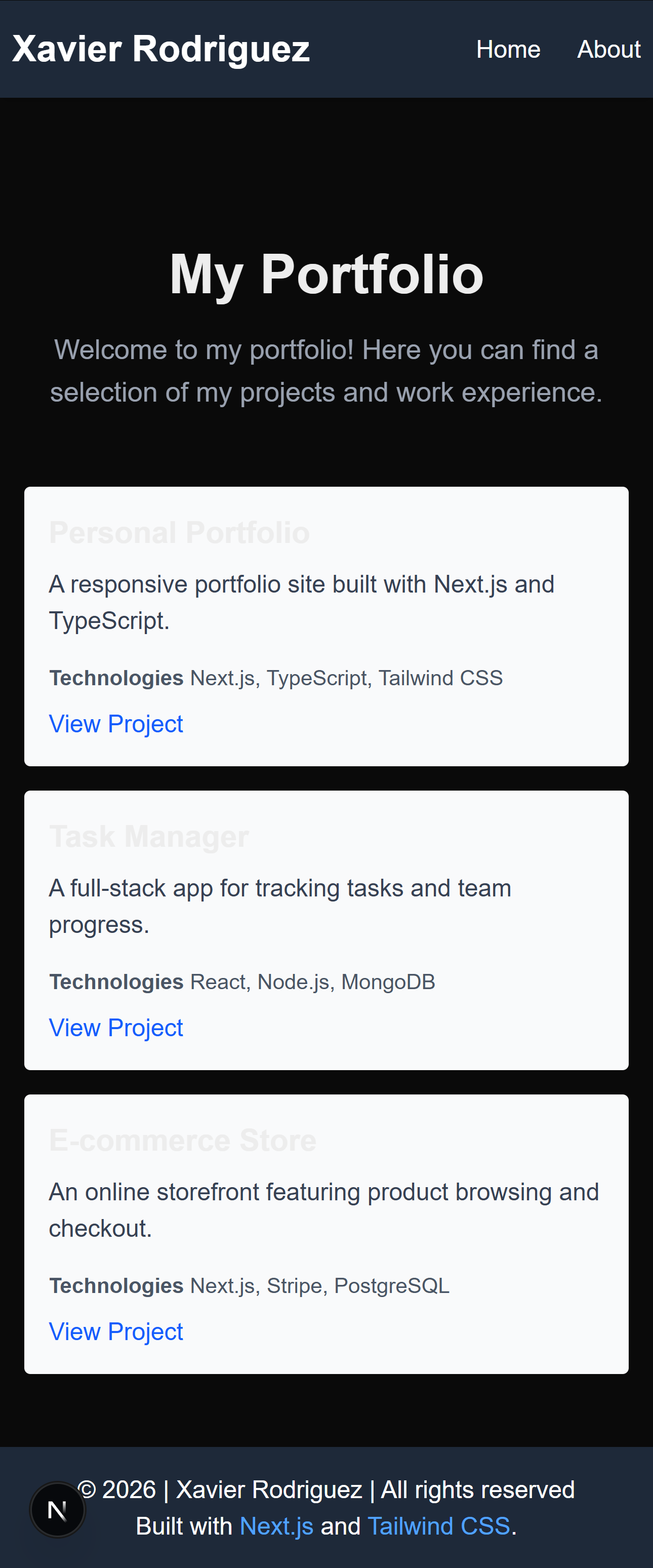
Deploy to Vercel
- Login to vercel.com.
- Select Add New → Project and import your
wdd430-portfolioGitHub repository. - Confirm the framework preset is detected as Next.js.
- Select Deploy and wait for the deployment to complete.
- Check your Vercel deployed application in a browser.
- Copy your Vercel deployment URL (generic example given:
https://portfolio-username.vercel.app). - Update the README file in your wdd430-portfolio repository with the Vercel deployment URL in order for your teammates to access it next week during the code review.
- Disable Vercel's Deployment Protection so your grader and teammates can open the URL without logging in to Vercel:
- In your Vercel project, open Settings → Deployment Protection.
- Turn off Vercel Authentication (set it to Disabled, or "Standard Protection" → off).
- Save your changes, then open your deployment URL in a private/incognito browser window to confirm it loads without prompting for a Vercel login.
Deployment Protection blocks your grader. By default, Vercel requires anyone who opens a preview or production URL to log in with a Vercel account before they can see the app. Your grader and teammates don't have access to your Vercel account, so if you leave this setting on, they will not be able to open your app at all — this is one of the most common reasons students are asked to resubmit. This setting applies to the whole project, so it covers every branch and every future deployment you push to it, not just the URL you submit today.
Why Vercel? Vercel is the platform created by Next.js developers. It deploys Next.js apps automatically with optimizations and provides a live URL for graders to review your work.
Submission
Return to Canvas and submit in the text entry these required deliverables.
- A link to your deployed Vercel application (For example,
https://portfolio-username.vercel.app) - A link to your
wdd430-portfoliorepository on GitHub (For example,https://github.com/your-username/wdd430-portfolio)Be sure to check your submission URLs yourself before submitting your assignment to the graders. Open your Vercel URL in a private/incognito window — if it asks you to log in to Vercel, your Deployment Protection is still on and your grader will not be able to view your app.
- The filename of your custom component (For example,
SkillCard.tsx) and a one-sentence description of what it displays - Answer these 2 questions using 1 or 2 sentences each:
- What is the purpose of
app/layout.tsxin the Next.js App Router? - Why are the components in this assignment Server Components rather than Client Components?
- What is the purpose of