CSS Components and Architecture
Writing CSS for small projects feels straightforward. You add styles as needed, maybe organize them by page or feature, and everything works fine. However, as projects grow, this approach breaks down. Styles conflict, specificity battles emerge, and nobody knows where to add new styles or whether existing styles are safe to modify. The problem is not the CSS itself but the lack of architectural planning.
CSS architecture provides systematic approaches to organizing styles in ways that scale. These methodologies define how to structure files, layer specificity, separate concerns, and build reusable components. Understanding these patterns prepares you for working on large codebases and helps you understand how modern CSS frameworks make their organizational decisions.
Component-Based CSS Organization
Modern CSS organization revolves around components rather than pages. Instead of organizing styles by where they appear (homepage styles, about page styles), you organize by what they are (button components, card components, navigation components). This shift in thinking makes styles more reusable and maintainable.
Separating Concerns
Well-organized CSS separates different types of styles into distinct layers. Each layer has a specific purpose and level of specificity. This separation prevents conflicts and makes it clear where new styles belong.
Most architecture patterns separate concerns into categories like these:
- Base or Reset Styles: Global defaults that apply to raw HTML elements. These normalize browser differences and establish foundational styles like typography, colors, and spacing systems.
- Layout Styles: Structural patterns that define how content is arranged on the page. These include grid systems, container patterns, and spacing utilities that work across components.
- Component Styles: Self-contained, reusable pieces of UI. Each component encapsulates the styles it needs to function independently.
- Utility Styles: Single-purpose classes that do one thing well. These provide flexibility for quick adjustments without writing new CSS.
- State and Theme Styles: Styles that handle conditional appearances like hover states, loading states, error states, or theme variations like dark mode.
Reusable Component Patterns
Components become reusable when they make no assumptions about their context. A well-designed button component works whether it appears in a navigation bar, a form, or a modal dialog. This independence comes from avoiding external dependencies like margins or positioning that tie the component to specific locations.
Consider a card component. A reusable card defines its internal appearance (background, border, padding, typography) but does not set its own width or margin. The parent container or layout system handles positioning and sizing. This separation allows the same card to work in a grid, a sidebar, or a single-column layout without modification.
    /* Reusable card - no external geometry */
    .card {
        background: white;
        border-radius: 0.5rem;
        box-shadow: 0 0.125rem 0.5rem oklch(0 0 0 / 0.1);
        padding: 1.5rem;
    }

    /* Layout controls card placement */
    .grid {
        display: grid;
        grid-template-columns: repeat(auto-fit, minmax(20rem, 1fr));
        gap: 2rem;
    }

    .grid > .card {
        /* Card adapts to grid layout */
    }
Component Composition
Complex interfaces emerge from composing simple components together. A product listing page might compose cards, buttons, images, and price displays. Each component handles its own concerns, and the page layout orchestrates how they fit together. This composition strategy keeps components simple and focused while enabling complex interfaces.
ITCSS: Inverted Triangle CSS
ITCSS (Inverted Triangle CSS), developed by Harry Roberts, organizes CSS by specificity and reach. Styles progress from generic and far-reaching to specific and localized, forming an inverted triangle where broad base styles sit at the top and specific component styles sit at the bottom. This organization aligns with how CSS specificity naturally works, making the cascade predictable rather than problematic.
The Inverted Triangle Structure
ITCSS divides CSS into seven layers, each with increasing specificity and decreasing reach. As you move down the triangle, styles become more specific and affect fewer elements. The graphic below is adapted from Xfive's excellent article on ITCSS, which provides additional detailed examples and explanations if you want to explore this methodology further.
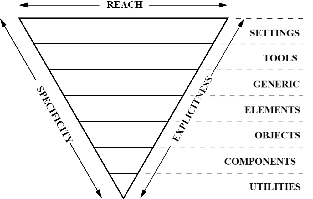
The seven layers work together to create a cohesive system:
1. Settings
The settings layer contains global variables like colors, typography scales, spacing systems, and breakpoints. These establish the design tokens that all other layers reference. This layer produces no CSS output itself but provides the foundation everything else builds upon.
    /* Settings layer - design tokens */
    :root {
        --color-primary: oklch(0.5 0.15 250);
        --color-text: oklch(0.2 0 0);
        --font-base: 'Roboto', sans-serif;
        --space-sm: 0.5rem;
        --space-md: 1rem;
        --space-lg: 2rem;
    }
2. Tools
Tools include mixins and functions used throughout the codebase. In modern CSS with custom properties, this layer is less prominent than in preprocessor-heavy architectures, but it remains useful for complex calculations or reusable patterns.
3. Generic
Generic styles include CSS resets, normalize rules, and box-sizing declarations. These create a consistent baseline across browsers, removing default margins, padding, and styling inconsistencies.
    /* Generic layer - resets */
    * {
        margin: 0;
        padding: 0;
        box-sizing: border-box;
    }
4. Elements
Element styles apply to bare HTML elements without classes. This layer establishes default typography, link styles, list appearances, and other foundational element styling. These styles have low specificity and are easily overridden by later layers.
    /* Elements layer - bare HTML styling */
    body {
        font-family: var(--font-base);
        color: var(--color-text);
        line-height: 1.6;
    }

    h1, h2, h3 {
        font-weight: 700;
        line-height: 1.2;
    }

    a {
        color: var(--color-primary);
    }
5. Objects
Objects are class-based layout patterns that provide structure without decoration. These include layout grids, containers, media objects, and other structural patterns that organize content. Objects focus on arrangement, not appearance.
    /* Objects layer - structural patterns */
    .container {
        max-width: 120rem;
        margin-inline: auto;
        padding-inline: var(--space-md);
    }

    .flow > * + * {
        margin-block-start: var(--flow-space, 1em);
    }
6. Components
Components are the designed pieces of UI that users interact with. Buttons, cards, navigation menus, forms, and other specific interface elements live in this layer. Components combine structure and appearance to create complete, reusable patterns.
    /* Components layer - designed UI pieces */
    .button {
        padding: var(--space-sm) var(--space-md);
        background: var(--color-primary);
        color: white;
        border: none;
        border-radius: 0.25rem;
        cursor: pointer;
    }
7. Utilities
Utilities sit at the bottom of the triangle with the highest specificity. These single-purpose classes override previous layers when needed. Utilities often use !important to ensure they always apply, providing escape hatches for quick adjustments.
    /* Utilities layer - overrides */
    .text-center {
        text-align: center !important;
    }

    .hidden {
        display: none !important;
    }
Why ITCSS Works
ITCSS aligns with CSS's natural specificity model. By organizing styles from least to most specific, you work with the cascade rather than fighting it. This structure makes it obvious where new styles belong and prevents specificity conflicts. When you need to override a style, you move to a more specific layer rather than increasing selector complexity.
The inverted triangle also makes source order meaningful. Because later layers override earlier ones, you can progressively refine styles as you move through the layers. Base element styles get established, then structural patterns, then components, and finally utility overrides when needed.
SMACSS: Scalable and Modular Architecture
SMACSS (Scalable and Modular Architecture for CSS), created by Jonathan Snook, organizes CSS into five categories. Unlike ITCSS's specificity-based layers, SMACSS focuses on the role each style plays in the interface. This categorization helps teams understand where styles belong and how they should be written.
The Five Categories
SMACSS divides all CSS into these categories:
- Base: Default styles for HTML elements, similar to ITCSS's elements layer
- Layout: Major structural components like headers, footers, sidebars, and main content areas
- Module: Reusable, modular components that are the building blocks of pages
- State: Styles that describe how modules or layouts look in different states (active, disabled, hidden)
- Theme: Styles that define colors and typography for different themes or brands
Naming Conventions
SMACSS recommends prefixing classes to indicate their category. Layout classes might use l- or layout-, state classes use is-, and theme classes might use theme-. This convention makes scanning HTML and CSS easier because the class name immediately tells you its purpose and category.
    /* Layout */
    .l-header {
        /* header structure */
    }

    /* Module */
    .card {
        /* card component */
    }

    /* State */
    .is-active {
        /* active state */
    }
For a deeper exploration of SMACSS with helpful visual diagrams, visit this article on Medium. The article includes a useful graphic showing how the five categories relate to each other and provides practical examples of implementing SMACSS in real projects.
Atomic CSS
Atomic CSS takes a radically different approach from ITCSS and SMACSS. Instead of organizing styles into component-based classes, Atomic CSS uses single-purpose utility classes that do exactly one thing. Each class applies a single CSS property, and you compose these atomic utilities together in your HTML to create designs.
The Atomic Philosophy
The atomic approach argues that creating unique class names for every component leads to CSS bloat. Instead, you build a library of utility classes that can style any component. Rather than writing .card { padding: 1rem; background: white; border-radius: 0.5rem; }, you write <div class="p-4 bg-white rounded"> and compose utilities directly in HTML.
    /* Atomic CSS utilities */
    .p-4 { padding: 1rem; }
    .bg-white { background: white; }
    .rounded { border-radius: 0.5rem; }
    .text-center { text-align: center; }
    .font-bold { font-weight: 700; }
Atomic CSS in Practice
Pure Atomic CSS, as defined by the original methodology, is less common today. However, the ideas behind Atomic CSS heavily influenced modern utility-first frameworks. Tailwind CSS, which you will learn later in this course, is a popular implementation of atomic principles. Tailwind provides thousands of pre-built utility classes and tools for composing them efficiently, making utility-first development practical for real projects.
To learn more about the original Atomic CSS methodology, visit the Atomic CSS documentation. While pure Atomic CSS is less common, understanding its principles helps you appreciate why utility-first frameworks like Tailwind became so popular and how they solve the problems Atomic CSS identified.
Modern Component Architecture
Today's CSS architecture often blends ideas from multiple methodologies. Modern projects might use ITCSS's layered approach for organizing files while adopting BEM-style naming for components and including utility classes inspired by Atomic CSS. The key is understanding the principles behind each approach so you can adapt them to your project's needs.
Combining Approaches
A modern component architecture might look like this:
- Base layer establishes design tokens, resets, and element defaults (from ITCSS)
- Layout layer provides structural patterns and composition utilities (from SMACSS and CUBE CSS)
- Component layer builds reusable UI pieces with clear naming conventions (from BEM or similar)
- Utility layer offers single-purpose helpers for quick adjustments (from Atomic CSS principles)
This hybrid approach gives you the structure of ITCSS, the clarity of SMACSS categories, the explicit naming of BEM, and the flexibility of utilities. You choose tools based on what solves your specific problems rather than strictly following any single methodology.
File Organization Patterns
How you organize CSS files matters as much as how you organize styles within files. Good file organization makes finding and modifying styles straightforward, even in large codebases.
Common Organization Strategies
Most projects organize CSS files by layer or category:
    styles/
    ├── base/
    │   ├── reset.css
    │   ├── typography.css
    │   └── variables.css
    ├── layout/
    │   ├── container.css
    │   ├── grid.css
    │   └── flow.css
    ├── components/
    │   ├── button.css
    │   ├── card.css
    │   └── navigation.css
    └── utilities/
    │   ├── spacing.css
    │   ├── text.css
    │   └── display.css
This structure makes it obvious where to find styles and where to add new ones. Base styles live together, layout patterns are grouped, each component has its own file, and utilities are separated by function.
Loading Order Matters
CSS files must load in the correct order to maintain the specificity cascade. Base styles load first, then layout, then components, then utilities. This ensures that more specific styles can override less specific ones as intended. Modern CSS provides tools like @import and @layer to manage loading order explicitly, which you will learn about later in this unit.
Best Practices for CSS Architecture
Regardless of which methodology you choose, certain principles apply universally to well-architected CSS:
Keep Components Independent
Components should not depend on their context to function correctly. Avoid writing styles like .sidebar .button that only work when the button is inside a sidebar. Instead, create button variants if needed: .button, .button--small, .button--secondary.
Use Consistent Naming
Pick a naming convention and follow it consistently. Whether you choose BEM, SMACSS prefixes, or another system, consistency makes the codebase easier to navigate. Team members should be able to predict what a class does based on its name.
Organize by Specificity
Place low-specificity styles before high-specificity styles. This aligns with how the cascade works and makes overriding styles predictable. Base element styles come first, then class-based patterns, then more specific component styles, then utility overrides.
Document Your Architecture
Write down your architectural decisions. Document which methodology you are using, how files are organized, where new styles should go, and any project-specific conventions. Future developers (including future you) will appreciate the guidance.
Balance Reusability and Specificity
Highly reusable components tend to be more generic. Highly specific components tend to be less reusable. Find the right balance for your project. Not everything needs to be maximally reusable if that reusability adds unnecessary complexity.
Looking Ahead
Understanding CSS architecture sets the foundation for advanced CSS topics. Later in this unit, you will learn about @import for loading stylesheets and @layer for explicitly controlling cascade layers. These modern CSS features make implementing architectural patterns easier by giving you direct control over loading order and specificity.
You will also explore CSS frameworks like Tailwind that implement these architectural principles at scale. Understanding the theory behind ITCSS, SMACSS, and Atomic CSS helps you understand why frameworks make the choices they do and how to use them effectively.
As you work on the team project, you will apply these architectural principles to organize a real codebase. The decisions you make about file structure, naming conventions, and component organization will directly impact your team's ability to work together efficiently and maintain the project over time.
Key Concepts Summary
CSS architecture provides systematic approaches to organizing styles at scale. ITCSS organizes by specificity, creating an inverted triangle from generic base styles to specific utilities. SMACSS organizes by role, dividing styles into base, layout, module, state, and theme categories. Atomic CSS uses single-purpose utility classes composed together in HTML, influencing modern frameworks like Tailwind.
Modern projects often blend these approaches, taking the best ideas from each methodology. The goal is not to follow any methodology perfectly but to understand the principles behind them so you can make informed architectural decisions. Good CSS architecture makes codebases maintainable, helps teams work together effectively, and scales as projects grow.
Explore Further
To deepen your understanding of CSS architecture, explore these topics independently:
- Read Harry Roberts' articles on ITCSS to understand the methodology's origins and see detailed implementation examples.
- Study the original SMACSS book by Jonathan Snook, available online, for comprehensive coverage of the methodology with real-world case studies.
- Examine how popular CSS frameworks organize their code. Bootstrap, Foundation, and Bulma each implement architectural principles differently, providing insight into practical architecture decisions.
- Explore modern CSS methodologies like CUBE CSS by Andy Bell and see how they adapt traditional architecture patterns for modern CSS capabilities.
- Look at open-source project repositories to see how real teams organize CSS in production codebases. GitHub is full of examples showing different approaches to the same problems.