CSS Animations and Transitions
Overview
The animation property in CSS enables developers to implement animations without the need for
JavaScript. These animations are performance-efficient and are well-suited for creating subtle transitions between
defined CSS style states over a specified duration.
The transition property in CSS allows for the smooth interpolation of style changes over a specified
duration. By defining which properties should transition and the timing of the transition, developers can enhance
user experience through subtle, visually appealing effects triggered by changes in an element's state.
Prepare
The following explains the CSS baseline properties to implement visual effects on web pages.
Keyframes
The @keyframes rule in CSS defines the steps of an animation, specifying how an element's styles
should change over time.
You use @keyframes to create an animation by naming it and defining what should happen at different
points (called keyframes) during the animation's timeline, such as at 0%, 50%, or 100%.
The following is an example of an animation for a fade in effect:
@keyframes fadeIn {
  0% {
    opacity: 0;
  }
  100% {
    opacity: 1;
  }
}
And, the following example produces a fade color effect that fades from red to yellow:
@keyframes fadeColor {
  from {
    background-color: red;
  }
  to {
    background-color: yellow;
  }
}
Once defined, the new keyframes animation can be referenced in an animation rule as shown below.
Animations
The animation can be defined directly through the animation shorcut property, or by specifying any
of its sub-properties directly:
animation-name: Specifies the name of the @keyframes animation to apply to the element.animation-duration: Defines how long the animation takes to complete one cycle.animation-timing-function: Controls the speed curve of the animation, such as linear or ease-in.animation-delay: Sets how long to wait before the animation starts.animation-iteration-count: Specifies how many times the animation should repeat.animation-direction: Determines whether the animation should play forward, backward, or alternate directions.animation-fill-mode: Defines how styles are applied before and after the animation runs.animation: A shorthand property to specificy several animation sub-properties all at once: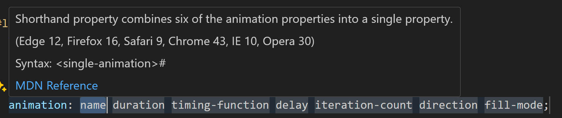
Animation shorthand properties
The following applies the fadeIn animation defined above to a box class:
.box {
  animation-name: fadeIn;
  animation-duration: 2s;
}
And the next example applies the fadeColor animation:
.box {
  width: 150px;
  height: 150px;
  background-color: red;

  /* Use the shorthand animation property */
  animation: fadeColor 2s ease-in-out infinite alternate;
}
Transitions
Similar to the animation property, there are a number of rules for transitions that can be defined
for each transition sub-property or all at once using the shorthand transition property.
The following transtition properties are available:
transition-property: Specifies the CSS property or properties that should transition when they change.transition-duration: Defines how long the transition takes to complete.transition-timing-function: Controls the speed curve of the transition, such as ease, linear, ease-in-out.transition-delay: Sets how long to wait before starting the transition after a property change.transition: A shorthand property for all the transition properties.
The following is an example that smoothly transitions from a white background to a light blue background over 0.5 seconds when the user hovers over the box:
.box {
  width: 200px;
  height: 200px;
  background-color: white;
  border: 1px solid #ccc;

  transition: background-color 0.5s ease;
}

.box:hover {
  background-color: lightblue;
}
In the next example, when the user hovers over the box it will grow in width and height after a slight delay with a smooth motion in and out:
.box {
  width: 100px;
  height: 100px;
  background-color: coral;
  transition: width 0.3s ease-in-out 0.2s, height 0.3s ease-in-out 0.2s;
}

.box:hover {
  width: 150px;
  height: 150px;
}
Transform
The CSS transform property allows you to apply 2D or 3D transformations to an element.
Common transform functions include:
translate(x, y): Moves the element left/right (x) and up/down (y).rotate(angle): Rotates the element by a specified angle (for example,rotate(45deg)).scale(x, y): Resizes the element (for example,scale(1.5)makes it 150% larger).skew(x-angle, y-angle): Skews the element along the x or y axis.
The following is an example of a transform rule that will rotate the element 15 degrees, move it 20 pixels to the right, and enlarge it to 120% of its original size.
.box {
  transform: rotate(15deg) translateX(20px) scale(1.2);
}
Advantages
There are several advantages of using CSS for animations compared to JavaScript or some other means.
- Performance: Leverages the browsers's hardware accelerations creating smoother animations and better performance.
- Ease of Use: Relatively easy to implement.
- Flexibility: Used to create a wide variety of animations.
- Browser Compatibility: Well-supported and easily degrade on older browsers, hopefully not breaking the user experience.
- Accessibility: Provides visual clues and feedback to users.
Any visual effect should have a clear purpose and developers must consider accessibility best practices, such as ensuring animations can be paused or disabled for users who may experience motion sensitivity or have cognitive disabilities.
Activity Instructions
Build each of the following CSS animations using CodePen or by creating a simple page.
- Use the
animationshorthand,@keyframes, andtransformto create the following "loading ..." animation:Check Your Understanding
This code assumes that there is a
divwith anidof loader#loader { margin: 2rem; width: 50px; /* width of the loader */ height: 50px; /* height of the loader */ border: 5px solid transparent; /* border width */ border-color: #999 transparent #999 transparent; /* border colors (4 - 2 transparent) */ border-radius: 50%; /* make it round */ animation: spin 1.5s linear infinite; /* spin animation with duration and continuous */ box-shadow: 0 0 1rem rgb(0 0 255 / 40%); /* blueish shadow effect on round div */ } #loader::after { content: '⚙️'; position: absolute; top: 50%; left: 50%; transform: translate(-50%, -50%); animation: pulse 1.5s ease-in-out infinite; } @keyframes spin { 100% {transform: rotate(360deg);} /* spin 360 degrees */ } @keyframes pulse { /* pulse the gear emoji */ 0%, 100% {transform: translate(-50%, -50%) scale(1);} /* scale to 1 */ 50% {transform: translate(-50%, -50%) scale(1.25);} /* scale to 1.25 */ } - Now use the
transitionproperty to create the following animation which activates when the user hovers over the image.Check Your Understanding
This code assumes that there is a
divwith anidof loader-t.loader-t { /* the only thing that changed was using transition versus animation */ transition: spin 1.5s linear infinite; } .loader-t::after { /* the only thing that changed was using transition versus animation and the size and visibility at start */ transform: translate(-50%, -50%) scale(0); transition: transform 1.5s ease-in-out; font-size: 2rem; } .loader-t:hover { transform: rotate(360deg); /* Rotate on hover */ } .loader-t:hover::after { transform: translate(-50%, -50%) scale(1.5); /* Scale on hover */ }CSS transition cannot automatically loop like animation.
Test and Share
Test your updates and share your work with your peers on Microsoft Teams.
Optional Resources
- Reference: Using CSS animations – MDN
- Reference: Using CSS transitions – MDN
- Watch: Browser DevTools: Animation &ndassh; A demonstration of working with animations by Web Dev Simplified.