W01 Learning Activity: Site Navigation
Overview
Site navigation is a critical part of any website. It allows users to find their way around the site and discover content. In this activity, you will learn how to create a responsive navigation menu that works well on both small and large screens.
Prepare
Most sites use an unordered list with list items and anchors for the primary navigation site links. This is a common practice because:
- Semantic Clarity: The links are grouped as related items and the order of those links does not really matter.
- Accessibility: Screen readers and other assistive technology can predictable interpret this structure as a navigation list.
- Flexibility: The unordered list can be styled with CSS to display the links in a variety of ways, such as horizontally or vertically.
- Consistency: This structure is a widely adopted convention in modern tools and frameworks.
Activity Instructions
In this activity, you will create a responsive navigation menu that works well on both small and large screens. You will use HTML, CSS, and JavaScript to build the menu.
HTML
To start, we will create a nav tag that will contain our navigation links. Inside the
nav tag, we will create an unordered list (ul) with list items (li) for
each link. Each list item will contain an anchor tag (a) that links to the appropriate page.
Here is an example of what the HTML for the navigation menu might look like:
<nav id="nav-bar" class="navigation">
  <ul>
    <li class="current"><a href="#">News & Events</a></li>
    <li><a href="#">Dedicated Temples</a></li>
    <li><a href="#">Announced Temples</a></li>
  </ul>
</nav>
In this example, notice that the nav tag has an id. This is so that we can easily
connect to it with JavaScript. It also has a class attribute that will be used as a CSS selector. In
addition, one of the list items has a class of "current" assigned to it. This
class name can be anything you want. It allows us to visually change this list item so we can implement
Wayfinding.
Wayfinding is the usability design effort of helping users navigate a website or application. It supports user friendly navigation by providing a clear indication of the user's current location within a website. There are two important principles to keep in mind when implementing wayfinding:
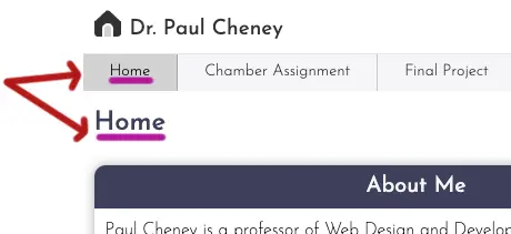
- The page name and the navigation link name should closely match. (see "Home" example below)
- The current menu item should also look different than the remaining menu items. (In the example below, the background color of the home button is darker.)
JavaScript
- Write a line of code to select the
navelement as given in the example above.Check Your Understanding
const navBar = document.querySelector('#nav-bar'); - Add a line of code to the
navButtonevent listener in the previous learning activity to toggle (add or remove) the class of 'show' to the nav element selected in the previous step.Check Your Understanding
navButton.addEventListener('click', () => {
  navButton.classList.toggle('show');
  navBar.classList.toggle('show');
});
CSS
- Add a CSS rule to not display (hide) the
navelement by default.Check Your Understanding
.navigation { display: none; } - Add a CSS rule to show the
navelement when it has the class of 'show'.Check Your Understanding
.navigation.show { display: block; } - At this point you should successfully be showing and hiding the navigation links on small screens. As the
screen gets wider, we need to display the nav tag even if it does not have the 'show' class added. To do this we
need to add the following to the larger.css file.
.navigation { display: block; } - Write a modern CSS declaration to have the unordered list
ullist itemslidisplay horizontally.Check Your Understanding
.navigation ul {display: flex;}Code Example CSS Flexbox Menu Example code for a navigation menu using CSS Flexbox
At this point you will have a fully functional but very ugly set of navigation links. Use your existing knowledge of CSS to make sure the links meet the minium height requirements for touch screens and match your color scheme.
Video Demonstrations
Follow along with the following video tutorials to see an example of how to build the navigation menu step by step. The video is broken into two parts: one for small screens and one for larger screens.
Watch WDD231 Site Navigation 1 Build the small screen navigation
Watch WDD231 Site Navigation 2 Build the larger screen navigation