W01 Learning Activity: Site Header
Overview
The site header for the assignment this week will contain an svg logo which you will find or create. The header will also contain the site name, which will be your name, and a hamburger icon on small screens to show and hide the navigation.
You will use CSS Grid and grid-template-columns to create a header that is responsive to the page width.
Prepare
Logos
A logo is a graphic mark, emblem, or symbol used to aid and promote instant public recognition. Logos are used by commercial enterprises, organizations, and even individuals to promote their brand, identity, and products. A good logo is an important part of a website because it helps to create a strong first impression and establishes a brand identity. It also helps to create a sense of trust and credibility with users.
Here are some things to consider when building a good logo.
- Timeless: A timeless logo remains effective and relevant even if trends change.
- Simple: A great logo should be easy to understand and remember, which means using a simple design.
- Memorable: A great logo should be unique and stand out.
- Relevance: A logo should be relevant in order to create immediate recognition establishes a strong first and lasting impression of a brand.
There are many websites where you can find an icon or logo and download an svg file for free.
For example, note how these popular websites icons meet the above criteria.
Navigation Icons
While there many kinds of small screen navigation patterns that are recognized, this course will use one that is very common. Small screen navigation links will stacked vertically using a ☰ entity to show the links and a × entity to hide the links. On large screens, the hamburger button will be hidden and the navigation links will be displayed horizontally.
For the navigation button on small screens, the <button> tag will be used and then use CSS to
insert the correct entity. Note the CSS code for each entity that will be used in the activity:
| Entity | Symbol | HTML | CSS |
|---|---|---|---|
| Hamburger Icon | ☰ | ☰ | \2630 |
| Close Icon | × | × | \00D7 |
| Since these are entities, they will look different depending on the font family used. | |||
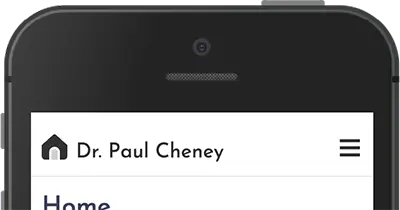
HTML Structure Example
As you look at this sample HTML below, you should notice there are three separate items in the header, the site logo, the site name, and a button.
<header>
  <img src="images/logo.svg" alt="site logo" width="1" height="1">
  <span>The Site Name</span>
  <button id="nav-button" class="hamburger" aria-label="navigation"></button>
</header>
Notice that the <img> tag has a width and height of 1px. This is to ensure that the image does
not take up any space in the header. The image will be controlled and displayed by the CSS.
CSS Layout Example
CSS Grid will be used to layout the header. In this example, the grid has three columns. The first column will be fixed at 24px wide for the logo, the second column will be auto width for the site name, and the third column will be 44px wide for the hamburger button.
header {
  display: grid;
  grid-template-columns: 24px auto 44px;
}
Design for Touch Devices
When designing for touch devices, it is important to consider the size of the touch targets. Touch targets are the areas that respond to user input, such as buttons and links. If the touch targets are too small, users may have difficulty tapping them accurately.
Touch targets include the area that responds to user input, in this case, the anchor tag. An icon may appear to be smaller but the clickable area needs to be large enough to touch easily.
- The Apple Design Handbook recommends that touch item on mobile devices be at least 44px by 44px.
- The Android Accessibility Guide suggests touch areas are at least 48dp by 48dp.
The Android Accessibility Guide uses the term dp, which stands for density-independent pixels.
Density-independent pixels are a unit of measurement that is used to ensure that touch targets are the same size on all devices, regardless of their screen resolution.
JavaScript Example
Use the JavaScript querySelector method to grab a reference to the hamburger button element. Setup a
click
event listener for the button. When the button is touched, it will toggle the class attribute value of 'show' on
the button.
const navButton = document.querySelector('#nav-button');

navButton.addEventListener('click', () => {
  navButton.classList.toggle('show');
});
Use CSS to display the entity
To change the entity for the button all you need to do is change the CSS when the class of 'show' is applied.
.hamburger::before {
  content: "\2630";
}
.hamburger.show::before {
  content: "\00D7";
}
In this example, the hamburger button will display the open icon when the class of 'show' is not applied and the close icon when the class of 'show' is applied using the principle of CSS specificity.
Activity Instructions
Follow along with the videos below and start to create a header for your site that contains a logo, site name, and a hamburger button. The header should be responsive to the page width and use CSS Grid to layout the items in the header.
Watch WDD231 Site Header 1Finding and modifying an SVG logo
Watch WDD231 Site Header 2Building the header using CSS Grid
Watch WDD231 Site Header 3Adding JavaScript to change the entity icon and hiding the icon for larger screens.