NPS - part 6
Time: 2 hours

Yellow: Instructor-Specified AI Usage
You may use AI as described in the assignment with the appropriate attribution.
AI can be used to help you with this assignment, but you should not rely on it too heavily. Use it to help you understand concepts, troubleshoot or get unstuck, or generate ideas. Do not use it to generate large amounts of code. If you do use AI, make sure to validate what it tells you with other sources.
Instructions
Complete the following assignment individually. Feel free however to work together with your classmates to accomplish the task. You are all solving the same problems and have different insights.
01 Review the provided screenshots
Review the following screenshots to understand how the global navigation will change for this activity. It includes submenus and looks different for the mobile and wide views. Again for this part we will be building a simplified version.
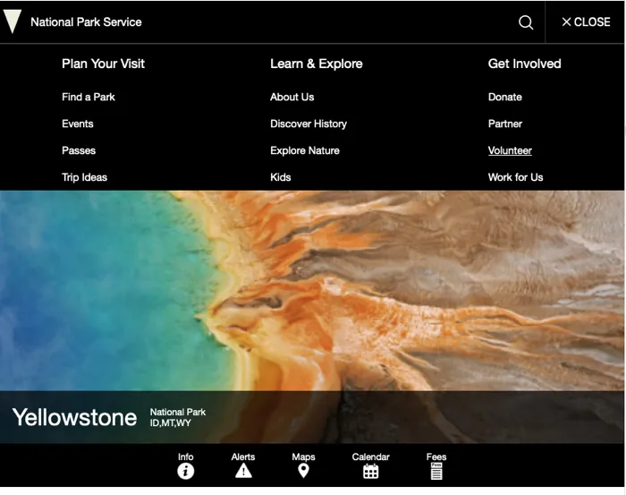
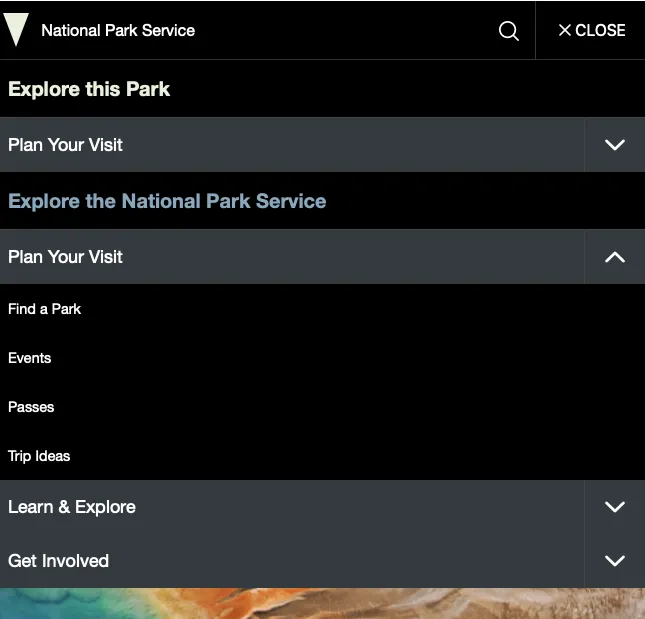
Here are a few things in particular to note:
- We will focus primarily on the second section: “Explore the National Park Service”.
- As we are not making any of the pages these links target, you can just set the href to ”#”, or if you would rather you could link them to the actual NPS pages.
- The NPS page uses accordians to hide and show menus on the mobile view to keep the page from becoming overwhelming.
- On the widescreen view the links are all shown.
- Note that the second section is the only one that remains in the top global navigation on wide screens as well.
You were given some of the code for the navigation already. If you look in the index.html file you will see the following:
<nav class="global-nav">
    <h2 class="global-nav__section-heading">Explore this Park</h2>
    <ul class="global-nav__list">
    <li>
        <div class="global-nav__split-button">
        <a href="#">Plan Your Visit</a>
        <button class="global-nav__split-button__toggle">
            <span class="visually-hidden"
            >Toggle submenu for Plan Your Visit</span
            >
            <svg class="icon" role="presentation" focusable="false">
            <use
                xmlns:xlink="http://www.w3.org/1999/xlink"
                xlink:href="/images/sprite.symbol.svg#arrow"
            ></use>
            </svg>
        </button>
        </div>
    </li>
    </ul>
</nav>
Notice that each major link category is made up of an anchor and a button. On mobile click the button will toggle the list of links open and closed. On wide screens the button will be hidden and the links are all shown. It would be worth opening up one of the official NPS sites to look at the rest of the structure in the HTML for those menus. The major thing that we are missing in our page is the actual list of links.
It was mentioned above that we will focus on the Second section, so we won’t add any more HTML for the first. If we do our classnames and styling correct however the first section should get styled correctly when we style the second.
Remember to type npm run start to start up your development server.
02 Write the HTML to build the menus
Working in the index.html file, add the HTML to build out the menus in the “Explore the National Park Service” section of the navigation. You can use the markup that is already there as a model for this new section. Pay close attention to the screenshots above to make sure that you get all the elements necessary for both the small screen and wide screen.
There are a lot of links under some of the sections. You only need to include the first 4 in each section.
After you have completed your version of this step, take a look at the example below.
Example 1
<nav class="global-nav">
    <h2 class="global-nav__section-heading">Explore this Park</h2>
    <ul class="global-nav__list">
    <li>
        <div class="global-nav__split-button">
        <a href="#">Plan Your Visit</a>
        <button class="global-nav__split-button__toggle">
            <span class="visually-hidden"
            >Toggle submenu for Plan Your Visit</span
            >
            <svg class="icon" role="presentation" focusable="false">
            <use
                xmlns:xlink="http://www.w3.org/1999/xlink"
                xlink:href="/images/sprite.symbol.svg#arrow"
            ></use>
            </svg>
        </button>
        </div>
    </li>
    </ul>
    <h2 class="global-nav__section-heading">Explore the National Park Service</h2>
    <ul class="global-nav__list">
    <li>
        <div class="global-nav__split-button">
        <a href="#">Plan Your Visit</a>
        <button class="global-nav__split-button__toggle">
            <span class="visually-hidden"
            >Toggle submenu for Plan Your Visit</span
            >
            <svg class="icon" role="presentation" focusable="false">
            <use
                xmlns:xlink="http://www.w3.org/1999/xlink"
                xlink:href="/images/sprite.symbol.svg#arrow"
            ></use>
            </svg>
        </button>
        </div>
        <ul class="global-nav__submenu" aria-label="Plan Your Visit submenu">
            <li><a href="#" >Find a Park</a></li>
            <li><a href="#" >Events</a></li>
            <li><a href="#" >Passes</a></li>
            <li><a href="#" >Trip Ideas</a></li>
        </ul>
    </li>
    <!-- ... duplicate the li above for the rest of the link list items ... -->
    </ul>
</nav>
03 Style
It would be worth making a list of what needs to happen for our menu to function correctly. We will be approaching this mobile first, so lets first make a list of what needs to happen for that to look right
- Hide the submenus by default.
- Style the menu as a single column list that spans the entire width of the screen.
- The h2 titles should be colored blue and green. Try and use the defined colors we were given that are defined as custom properties in our CSS, but make sure that your contrast is high enough for accessibility! (It’s interesting that the actual colors used in the official page are not listed in the custom properties…)
- The words of the submenu category should take up most of the width, be given a lighter background, and the button should be a square at the end
- When the submenu button (
global-nav__split-button__toggle) is clicked, the submenu should slide down to open…with a transition. - The links should be white on the dark background with no underline until hovered.
- The Background of the button should darken slightly when hovered.
Begin writing the CSS that will style the menu. I would recommend skipping step one at first. You will want it to show while you work out the CSS. Once you have it styled correctly then hide it by default.
We will also address steps 5, 6 in the next section.
Hints and tips
- It is interesting that many of the colors in the header are not in the list of custom properties provided that was taken from the actual website. The header and the content were probably created by different teams. There are some colors that can work however. Try
--bs-gray-800and--bs-gray-900for the light grey menu item color and the hover color. - We want our page to look good, and similar to the official page, but don’t lose too much time trying to make it pixel perfect.
- Remember that flexbox is a great way to center things horizontally, and vertically…
- A lot of the work that you need to do is simple margin and padding adjustment.
- Remember to leave everything expanded and showing while you work to get it looking right. Then once you are done add the CSS to hide all the menus.
Once you are done styling (or if you get stuck) compare with the example below. Remember to not copy and paste the code. You will gain much more if you review the example and then fix your code. The goal here is not to simply finish the activity, but to learn more about web development.
Example 2
header.css
/* Global nav styles */

.global-nav {
  width: 100%;
  grid-column: 1/3;
  border-top: 1px solid #333;
  max-height: 0;
  overflow: hidden;

}

.global-nav button {
  background-color: transparent;
  border: 0;
  padding: 1rem;
  cursor: pointer;
}

.global-nav svg {
  --icon-color: white;
}
.global-nav__section-heading {
  margin-top: 0;
  margin-bottom: 0;
  padding: 1rem 0.625rem;
  font-size: 1.25rem;
}
.section-heading--green {
  color: var(--bs-light-green);
}
.section-heading--blue {
  color: var(--bs-chathams-blue-3);
}

.global-nav__list {
  list-style: none;
  padding: 0;
  margin: 0;
  border-top: 1px solid #444;
}
.global-nav__split-button {
  display: flex;
  background-color: var(--bs-gray-800);
}
.global-nav__split-button > a {
  flex: 1;
  align-self: center;
  padding: 1rem 0.625rem;
  display: block;
}
.global-nav__split-button > button {
  display: flex;
  align-items: center;
  justify-content: center;
  padding: 1rem 1.25rem;
  border-left: 1px solid #444;
}
.global-nav__split-button > button:hover,
.global-nav__split-button > a:hover {
  background-color: var(--bs-gray-900);
}

/* Submenu styles */
.global-nav__submenu {
  list-style: none;
  padding: 0;
  font-size: 0.8em;
  overflow: hidden;
  max-height: 0;

}

.global-nav__submenu a {
  display: block;
  padding: 1rem 0.625rem;
}
.global-nav__submenu a:hover {
  text-decoration: underline;
}
04 Javascript: enable the buttons
We need some Javascript to enable the buttons to actually be able to show and hide our menus. For now we can modify the enableNavigation function we wrote last week. Attach an event listener to each button. First the main menu toggle, and then the sub menu toggles. Then write a function that will do the actual hiding and showing. This should be similar to what we did for the main menubar.
One challenge we need to address is that a click on a button will trigger the event, but the event should show the correct ul Element. Essentially we need to start at the button that triggered the event, then find the li that button is in, then get the ul that is inside of that li. Easy right? 😂
How can we do that? Check out the closest method.
One you have the buttons working, add a transition to make the menu slide open over time instead of instantly. Finally add the Javascript/css you would need to make the submenu toggles point up or down based on whether the submenu is open or closed.
Example 4
Javascript
function enableNavigation() {
  const menuButton = document.querySelector("#global-nav-toggle");
  const subMenuToggles = document.querySelectorAll(
    ".global-nav__split-button__toggle"
  );
  // when the main menu button is clicked:
  menuButton.addEventListener("click", (ev) => {
    // toggle the show class on the global-nav
    document.querySelector(".global-nav").classList.toggle("show");
    // check to see if we just opened or closed the menu
    if (document.querySelector(".global-nav").classList.contains("show")) {
      // if we opened it then set the aria-expanded attribute to true
      menuButton.setAttribute("aria-expanded", true);
    } else {
      // if we closed it then set the aria-expanded attribute to false
      menuButton.setAttribute("aria-expanded", false);
    }

    console.log("toggle");
  });
  subMenuToggles.forEach((toggle) => {
    //for each submenu toggle
    toggle.addEventListener("click", (ev) => {
      // find the closest li ancestor, then find the submenu inside of that li and toggle the show class
      ev.currentTarget
        .closest("li")
        .querySelector(".global-nav__submenu")
        .classList.toggle("show");
      // toggle the rotate class on the button icon that was clicked
      ev.currentTarget.querySelector(".icon").classList.toggle("rotate");
    });
  });
}
05 Wide screen menus
Finally we need to make the adjustments to our menut for a large screen. Let’s make another list.
- Hide the
h2for the “Explore this park” section - Hide the
ulfor the “Explore this park” section - Show all the submenus
- Have the submenus show in columns horizontally across the screen as show in the screenshot below.
Hints
- You will need a media query to make the changes at the right time. Play around with the width of the window and pick a spot where you think it makes sense to have the menu switch. The screen needs to be wide enough to accomodate all the menus horizontally.
- How can we select the ul for the “explore this park” section? We have a couple of options. We could just add a class to it, but there is another option as well. We want to hide the first
ulin that Element. We have special selectors that can target things like that: pseudo-classes. One of these is:first-of-type - How do we show all the submenus? Well we hid them by setting
max-height: 0. So we just need to set that back to what it would have been. One option isfit-content - Flexbox will be great to make all the submenus flow horizontally and to space them out.
Code
/* Adjust for wide screens */

@media (min-width: 768px) {
  .global-nav > h2,
  .global-nav__list:first-of-type {
    display: none;
  }
  .global-nav__submenu,
  .global-nav__list {
    display: flex;
    flex-direction: row;
    justify-content: space-around;
  }
  .global-nav__split-button {
    background-color: inherit;
  }
  .global-nav__split-button > button {
    display: none;
  }
  .global-nav__submenu {
    display: flex;
    flex-direction: column;
    max-height: fit-content;
  }
  .global-nav__submenu a {
    padding: 0.625rem;
  }
}
06 Refactor
We have the menus working on the main page, but we need them to work on all our pages. We could take main.js and add it to all our pages, but there is code in that file that is specific to index.html. We could also just copy/paste the code for our menus into a .js file specific to each of our pages…but that would be repeating code and if we ever needed to make changes to how the menus worked we would have to find all the places we used it and change each of them.
A better option would be to place the code we need to share into a module. While we are at it, we should take a close look at the enableNavigation function. Good functions should be small and focused. This one is not. Let’s break it up into smaller pieces that are more focused.
We also need a solution that will make it easy to spread this functionality to all our pages. Earlier we created a module called setHeaderFooter this does some work to set the correct information into the header and footer of any page. We are already using this on the two existing pages: index.html and conditions.html We can add the code to enable the menus there!
Create a file called navigation.mjs place the functions necessary to enable the navigation into that file and export what you need. Then remove the function from main.js. Import the one from our new module into setHeaderFooter.mjs and execute it.
You will need to update the HTML in conditions.html to add the rest of the menu. Once that is document, because we were already setting the header and footer info in conditions.html, this will automatically set the navigation up there as well.
Code
navigation.mjs
function mainMenuHandler(ev) {
  // toggle the show class on the global-nav
  document.querySelector(".global-nav").classList.toggle("show");
  // check to see if we just opened or closed the menu
  if (document.querySelector(".global-nav").classList.contains("show")) {
    // if we opened it then set the aria-expanded attribute to true
    ev.target.setAttribute("aria-expanded", true);
  } else {
    // if we closed it then set the aria-expanded attribute to false
    ev.target.setAttribute("aria-expanded", false);
  }

  console.log("toggle");
}

function subMenuHandler(ev) {
  // find the closest li ancestor, then find the submenu inside of that li and toggle the show class
  ev.currentTarget
    .closest("li")
    .querySelector(".global-nav__submenu")
    .classList.toggle("show");
  // toggle the rotate class on the button icon that was clicked
  ev.currentTarget.querySelector(".icon").classList.toggle("rotate");
}

export default function enableNavigation() {
  const menuButton = document.querySelector("#global-nav-toggle");
  const subMenuToggles = document.querySelectorAll(
    ".global-nav__split-button__toggle"
  );
  // when the main menu button is clicked:
  menuButton.addEventListener("click", mainMenuHandler);
  subMenuToggles.forEach((toggle) => {
    //for each submenu toggle
    toggle.addEventListener("click", subMenuHandler);
  });
}
setHeaderFooter.mjs
import enableNavigation from "./navigation.mjs";
...
export default function setHeaderFooter(parkData) {
  setHeaderInfo(parkData);
  setFooter(parkData);
  enableNavigation();
}
07 Commit and push to Github
Commit your changes, then push them to GitHub. Wait a few minutes then check to make sure they show on Netlify.
Instructor’s Solution
As a part of this activity, you are expected to look over a solution from the instructor, to compare your approach to that one. One of the questions on the I-Learn submission will ask you to provide insights from this comparison.
Please DO NOT open the solution until you have worked through this activity for at least one hour. At the end of the hour, if you are still struggling with some of the core requirements, you are welcome to view the instructor’s solution and use it to help you complete your own code. Even if you use the instructor’s code to help you, you are welcome to report that you finished the core requirements, if you code them up yourself.
After working as far as you can, click here for the instructor’s solution.