NPS - part 5
Time: 2 hours

Yellow: Instructor-Specified AI Usage
You may use AI as described in the assignment with the appropriate attribution.
AI can be used to help you with this assignment, but you should not rely on it too heavily. Use it to help you understand concepts, troubleshoot or get unstuck, or generate ideas. Do not use it to generate large amounts of code. If you do use AI, make sure to validate what it tells you with other sources.
Instructions
Complete the following assignment individually. Feel free however to work together with your classmates to accomplish the task. You are all solving the same problems and have different insights.
01 Review the provided screenshots
Review the following screenshot to see where we will be when we finish this activity.
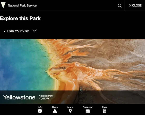
Here are a few things in particular to note:
- We will focus primarily on the second section: “Explore the National Park Service”.
- As we are not making any of the pages these links target, you can just set the href to ”#”, or if you would rather you could link them to the actual NPS pages.
- The NPS page uses accordians to hide and show menus on the mobile view to keep the page from becoming overwhelming.
- On the widescreen view the links are all shown.
- Note that the second section is the only one that remains in the top global navigation on wide screens as well.
You were given some of the code for the navigation already. If you look in the index.html file you will see the following:
<div class="global-header__right">
  <a class="search-icon" href="#park-footer">
    <svg class="icon">
      <use
        xmlns:xlink="http://www.w3.org/1999/xlink"
        xlink:href="/images/sprite.symbol.svg#search"
      ></use>
    </svg>
    <span class="visually-hidden">Search</span>
  </a>
  <button id="global-nav-toggle" >
      <svg class="icon">
        <use
          xmlns:xlink="http://www.w3.org/1999/xlink"
          xlink:href="/images/sprite.symbol.svg#menu"
        ></use>
      </svg>
      <span class="visually-hidden">Open</span> Menu
  </button>
</div>
<nav class="global-nav">
    <h2 class="global-nav__section-heading">Explore this Park</h2>
    <ul class="global-nav__list">
    <li>
        <div class="global-nav__split-button">
        <a href="#">Plan Your Visit</a>
        <button class="global-nav__split-button__toggle">
            <span class="visually-hidden"
            >Toggle submenu for Plan Your Visit</span
            >
            <svg class="icon" role="presentation" focusable="false">
              <use xlink:href="/images/sprite.symbol.svg#arrow"></use>
            </svg>
        </button>
        </div>
    </li>
    </ul>
</nav>
Note the button that will open and close the main menu. It has a menu icon, and the word “Menu”. If you go and check an official page however you will find that the icon and word change when the menu is open. We will need to modify our HTML to accomodate this.
Notice as well in the .global-nav section that each major link category is made up of an anchor and a button. On mobile click the button will toggle the list of links open and closed. On wide screens the button will be hidden and the links all shown. It would be worth opening up one of the official NPS sites to look at the rest of the structure in the HTML for those menus. The major thing that we are missing in our page is the actual list of links.
This assignment will be broken into two parts because of the scope. This part will work on getting the main menu to open and close, along with adding an Animation, and changing the button label depending on the current state of the menu. The next part will complete the submenus.
Remember to type npm run start to start up your development server.
02 Complete the HTML for the Menu button
Working in the index.html file, add the HTML to the global-nav-toggle button. We should start by adding an element to group up the current contents of the button. Add a class to the grouping element so we can easily grab it later with Javascript.
- We should start by adding an element to group up the current contents of the
button. Add a class to the grouping element so we can easily grab it later with Javascript. - Duplicate the new element (the icon and words) and then change the class identifying it, as well as the icon (note that there is an icon in the .svg file called
close), and the “Menu” to “Close” - There is an id on the actual button Element, and that will be good for selecting with Javascript, but it would be good to add a class as well. Something like
global-nav__togglewould fit in well with the other existing class names. - While we are at it we should also add a couple of attributes to the button for accessibility.
aria-expanded="false"andaria-label="Open Menu". We will need to change thearia-expandedtotruewhen the menu gets opened.
After you have completed your version of this step, take a look at the example below.
Example 1
Menu toggle button changes:
<button
    id="global-nav-toggle"
    class="global-nav__toggle"
    aria-expanded="false"
    aria-label="Open Menu"
     >
    <div class="global-nav__toggle--closed">
        <svg class="icon">
        <use
            xmlns:xlink="http://www.w3.org/1999/xlink"
            xlink:href="/images/sprite.symbol.svg#menu"
        ></use>
        </svg>
        <span class="visually-hidden">Open</span> Menu
    </div>
    <div class="global-nav__toggle--open">
        <svg class="icon">
        <use
            xmlns:xlink="http://www.w3.org/1999/xlink"
            xlink:href="/images/sprite.symbol.svg#close"
        ></use>
        </svg>
        Close
    </div>
</button>
03 Style
It would be worth making a list of what needs to happen for our menu to function correctly. We will be approaching this mobile first, so lets first make a list of what needs to happen for that to look right
- Hide the main menu and submenus by default.
- Hide the close word and icon by default.
- When the “Menu” (
global-nav__toggle) button is clicked show the main navigation (.global-nav), hide the “Menu” icon, and show the “Close” icon. We should also set ‘aria-expanded’ to true when the menu opens. When clicked again reverse everything. - Add a transition to the menubar. It should slide down when opened and slide back up when closed.
What does
aria-expandeddo?
aria-expandedis an attribute that is used to indicate whether a menu is expanded or collapsed. It is used by screen readers to let their users know the current state of a menu or other collapsable elements.
That doesn’t look too bad. Begin writing the CSS that will style the menu button. Hide the close icon. Then make sure that the global-nav element is hidden.
How should we hide the menus?
As you decide how to hide your submenus keep in mind that eventually we want the menus to slide open. Your first impulse might be to just do
display:noneon the element. This will indeed hide it, but you will run into problems later when you want to animate the opening and closing. What else could be done?We could reduce the height to 0, then restore it back to the right height when clicked…the problem is how tall should it be? If we set it to a value and the menu changes it will break. It would be a brittle solution. If we try and set the height back to
auto(the default) we will find that the animation will not work.Another option we have though is
max-height. If we set that to 0, then set it to something bigger than we need, it will animate!
We will also address steps 3, 4 in the next sections.
Once you are done styling (or if you get stuck) compare with the example below. Remember to not copy and paste the code. You will gain much more if you review the example and then fix your code. The goal here is not to simply finish the activity, but to learn more about web development.
Example 2
header.css
/* Global nav styles */

.global-nav {
  width: 100%;
  grid-column: 1/3;
  border-top: 1px solid #333;
  max-height: 0;
  overflow: hidden;

}

.global-nav__toggle--closed {
  display: flex;
  align-items: center;
}
.global-nav__toggle--open {
  display: none;
  align-items: center;
}
04 Javascript: enable the main menu button
We need some Javascript to enable the button to actually be able to show and hide our menu. Attach an event listener to the main menu button #global-nav-toggle. Then write a function that will do the actual hiding and showing. How can we accomplish this? Well in the previous step it was recommended that you reduce the max-height to 0. So an easy way to undo this would be to add a class that will set the max-height to something greater than 0. You will need to add the class in your CSS as well.
We also need to check to see if the menu is open or closed after the click. If it is open we need to set aria-expanded to true.
Here is a function stub to get you started on writing the event handler. You can do your initial building and testing with the code in main.js.
function enableNavigation() {
  // use a querySelector to get the menu buttons

  // when the main menu button is clicked:
  menuButton.addEventListener("click", (ev) => {
    let target = ev.target;
    // toggle the show class on the global-nav

    // check to see if target is the button or something inside the button

    // check to see if we just opened or closed the menu

      // if we opened it then set the aria-expanded attribute on the button to true

      // if we closed it then set the aria-expanded attribute on the button to false

  });
}
Caution!
When we click on the button we might also be clicking on the text inside the button! In that case
ev.targetmight not point to what we think it does. Before you try to set thearia-expandedattribute you should check to make sure we have the right target. Each element has a property calledtagNamethat you can use to check. We are looking for a “BUTTON”. Ifev.targetisn’t a button, it means we clicked on something inside the button and we can useElement.closest()to get back up to the button element we were expecting.
Finally we need to make sure that the text on the button changes as well.
For the button text we could add/remove classes to the elements, but there is actually a better way. We can take advantage of the fact that we are setting aria-expanded based on the menu state, and that the elements we want to show and hide are children of the button. We can use a attribute selector to write the CSS to swap our labels.
.global-nav__toggle[aria-expanded="true"] > .global-nav__toggle--open {
  display: flex;
}
You would read that selector like this: “Find the element with a class of
global-nav__toggle--openthat is the child of an element that has a class ofglobal-nav__toggleand an attributearia-expanded=true”
You will need another rule for the closed Element.
Once you have the buttons working, add a transition to make the menu slide open over time instead of instantly.
Example 4
main.js
function enableNavigation() {
  const menuButton = document.querySelector("#global-nav-toggle");

  // when the main menu button is clicked:
  menuButton.addEventListener("click", (ev) => {
    let target = ev.target;
  // toggle the show class on the global-nav
  document.querySelector(".global-nav").classList.toggle("show");
  // check to see if ev.target is the button or something inside the button
  if (target.tagName != "BUTTON") {
    target = target.closest("button");
  }
  // check to see if we just opened or closed the menu
  if (document.querySelector(".global-nav").classList.contains("show")) {
    // if we opened it then set the aria-expanded attribute to true
    target.setAttribute("aria-expanded", true);
  } else {
    // if we closed it then set the aria-expanded attribute to false
    target.setAttribute("aria-expanded", false);
  }

  console.log("toggle");
  });
}
header.css
/* Global nav styles */

.global-nav {
  width: 100%;
  grid-column: 1/3;
  border-top: 1px solid #333;
  max-height: 0;
  overflow: hidden;
  transition: all 0.5s;
}

.global-nav button {
  background-color: transparent;
  border: 0;
  padding: 1rem;
  cursor: pointer;
}

.global-nav svg {
  --icon-color: white;
}

.global-nav__toggle--closed {
  display: flex;
  align-items: center;
}
.global-nav__toggle--open {
  display: none;
  align-items: center;
}

.global-nav__toggle[aria-expanded="true"] .global-nav__toggle--closed {
  display: none;
}
.global-nav__toggle[aria-expanded="true"] .global-nav__toggle--open {
  display: flex;
}

.global-nav.show {
  max-height: 1000px;
}
05 Install ESLint
This week as part of your research you should have studied Linters. Linters can be very helpful in identifying problems with your code and in general imrpoving it’s quality. For Javascript the most common linter is called ESLint. Let’s install and configure it on our project.
First we need to install ESLint and it’s dependencies into our project. We can use NPM for this. Run the following commands in the terminal in VSCode. You need to make sure that you are in the correct directory. Type ls if you are on a Mac or Linux, or dir if you are Windows. You should see the package.json file listed.
- Run the following command to install ESLint:
npm init @eslint/config@latest - Follow the prompts to configure ESLint. You can accept the default settings in most cases. the exceptions are:
- Framework: none of these.
- Add the following line to your
package.jsonfile in thescriptssection:"lint": "eslint *.js src/**/*.js",This will allow us to run the linter by typingnpm run lintat the command line. It will look for any Javascript files in the root directory*.jsand any Javascript files inside thesrcdirectory (src/**/*.js) - Try running that command now.
- You can also configure ESLint to automatically fix some of the errors it finds. To do this Add the following line to your
package.jsonfile in thescriptssection:"lint-fix": "eslint *.js src/**/*.js --fix",Run the commandnpm run lint-fixto see the effect. - Another popular option is to configure ESLint to automatically run on save. To do this you will need to install the ESLint extension in VSCode. Pick the one published by Microsoft. It should automatically be setup to fix errors when you save a file…but you can check by opening the VS Code Settings, then going to “Extentions->ESLint”
When we setup ES Lint it selected a common set of recommended rules to enforce. We can change these to match our preferences. Open the file `eslint.config.mjs. Modify it to resemble the example below
export default [
  pluginJs.configs.recommended,
  {
    languageOptions: { globals: globals.browser },
    rules: {
      semi: "error"
    }
  }
];
This will enforce the use of semicolons at the end of every line. You can change the semi: "error" to semi: "off" to disable this rule, or to semi: "warn" to make it a warning instead of an error.
You can also add other rules to the rules object. For example, to enforce the use of the const keyword instead of let or var, you can add the following "prefer-const": "error" The ESLint documentation has a list of all the rules.
06 Commit and push to Github
Commit your changes, then push them to GitHub. Wait a few minutes then check to make sure they show on Netlify.
Instructor’s Solution
As a part of this activity, you are expected to look over a solution from the instructor, to compare your approach to that one. One of the questions on the I-Learn submission will ask you to provide insights from this comparison.
Please DO NOT open the solution until you have worked through this activity for at least one hour. At the end of the hour, if you are still struggling with some of the core requirements, you are welcome to view the instructor’s solution and use it to help you complete your own code. Even if you use the instructor’s code to help you, you are welcome to report that you finished the core requirements, if you code them up yourself.
After working as far as you can, click here for the instructor’s solution.