NPS - part 4
Time: 2 hours

Yellow: Instructor-Specified AI Usage
You may use AI as described in the assignment with the appropriate attribution.
AI can be used to help you with this assignment, but you should not rely on it too heavily. Use it to help you understand concepts, troubleshoot or get unstuck, or generate ideas. Do not use it to generate large amounts of code. If you do use AI, make sure to validate what it tells you with other sources.
Instructions
Complete the following assignment individually. Feel free however to work together with your classmates to accomplish the task. You are all solving the same problems and have different insights.
01 Review the provided screenshots
For our first child page we will be building a simplified version of the NPS Current Conditions page (Yellowstone is given as an example). Review the mockups below to get a feel for the changes we will make and what your page should look like when you are done.
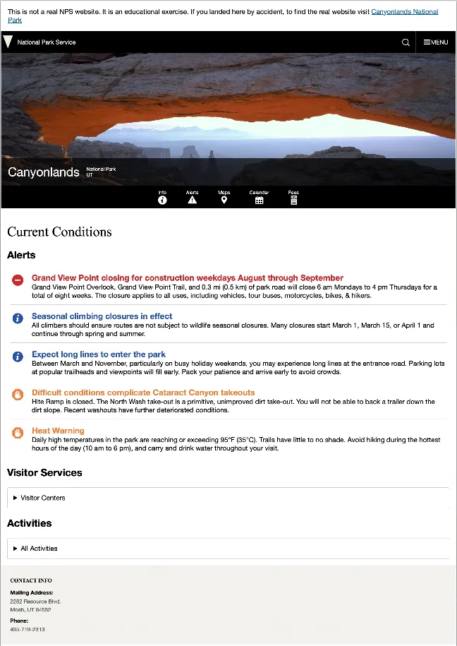
Here are a few things in particular to note:
- We are leaving out a lot of the sections. We have kept: Alerts, Visitor Services, and a list of Activities available at the park.
- Some of the information will be found in the general park info we pulled for the last part. Review the NPS API documentation again to see where we might get the rest of the data we need.
- The NPS page uses accordians to hide and show information to keep the page from becoming overwhelming. Note that all are closed when the page loads, you click to open a section, then if you click to open another section the previous closes. You can only have one open at a time.
- The borders do go all the way around those accordian boxes…on the screenshots the lines went a little weird.
After reviewing the mockups type npm run start to start. Remember that this will start up our development environment and should open the page in your default browser.
02 Begin the new page
Our new page will share many features from the Home page. So it would make sense to use the index.html as a starting point. Before we duplicate it however, let’s update a couple of links. Under the banner image there is a link to Info and another to Alerts. We are going to point both of these to the new page we are about to make. set the href of both of those links to conditions.html. Next duplicate the index page, and call the new file one conditions.html. Create a conditions.js file as well in the js folder. Update the script element to point to this new file. Create a new conditions.css file as well for the main styling of this new page and @import it into styles.css
Next we need to clear out the rest of the content in main. Then we need to create some elements for the new content. We need three: “Alerts”, “Visitor Services”, and “Activities”, make sure to add a class or id to each so we can manipulate them later.
As you consider your HTML structure keep semantics in mind. Notice from the mockup we have a list of alerts, then the visitor center and activities lists are a little different. This is because these two lists are potentially longer. In addition on the NPS page much of the content is hidden by default. How can we easily create this? Check out the details element. It has good support caniuse at 97%. And it even has the ability to only allow one open at a time (see the name attribute). We will use this element to create our accordions for the visitor center and activities, showing the list when the user clicks there.
Some of you may have noticed if you visited the caniuse link above that while
detailshas 97% support,details:nameonly has 82% support in browsers. So 18% of the people that visit the site will not have that feature work. That seems like a lot. Is it really ok to usename?Remember what the
nameattribute does for adetailselement. All details with the same name will be linked together so that only one can be open at a time. If that did not work what effect would it have on the page? Could the visitors still see all the content? Would the layout of the page still work? Would the page still be usable? Would the user experience still be good? For all of these questions the answer is “yes”. So while it would be nice to have the feature, it is not a deal breaker if it doesn’t work.This idea of making sure that the core functionality of a page works for all users is called progressive enhancement. Once you have ensured the core functionality, it is ok to add bells and whistles that may not work for everyone but will not negatively impact the core functionality. It is a good idea to keep in mind when building web pages.
Next open up the conditions.js file. We need to add the code back in to set the header and footer info.
After you have completed your version of this step, take a look at the example below.
Example 1
<main id="main">
      <h1>Current Conditions</h1>
      <section class="alerts">
        <h2>Alerts</h2>
        <ul></ul>
      </section>
      <section class="visitor">
        <h2>Visitor Services</h2>
        <details name="current-details">
          <summary>Visitor Centers</summary>
          <ul></ul>
        </details>
      </section>
      <section class="activities">
        <h2>Activities</h2>
        <details name="current-details">
          <summary>All Activities</summary>
          <ul></ul>
        </details>
      </section>
    </main>
import { getParkData } from "./parkService.mjs";
import setHeaderFooter from "./setHeaderFooter.mjs";

async function init() {
  const parkData = await getParkData();
  setHeaderFooter(parkData);
}

init();
Check your new page to make sure the header and footer info is set to your park.
Next we should make a list of the other things we need to do:
- Get the alerts from the api and create a template to use to display them.
- Get the infomation from the API for the Visitor Centers and display a list of them. We should also show an opening and closing date…and an indicator of whether the location is currently open.
- Get the list of activities for the park and display them.
03 Alerts Section
Some of this should feel like review. It is similar to what we did last week. See how far you can get on the first task. You will need to create a new function in parkService.mjs to retrieve the alerts. It will look very similar to the getParkData function. I would also recommend a new setAlerts function that will actually resemble the setParkInfoLinks function in main.js
You will be using the original park data from NPS 3 to get the parkCode property to use with your new API endpoint. For example, using this parkCode you will use the new endpoint with the park code to call getJson again to get a brand new set of data about the alerts for that park.
Then you will need a new template function that will build each alert. Refer to API documentation to know where the data you need is located in the data you will retrieve, and the Mockups above for this. You can find alert icons in the sprite-symbol.svg file.
You have probably never used an
<svg>element before. In the original HTML you were given there were examples of them being used. SVG is an image file format. It stands for “Scalable Vector Graphic”. One nice thing about them for the web is the “scalable” part. We can make them as big or as small as we want with no loss in quality. Another nice thing is that we can gather lots of SVG icons together in one file…likesprint-symbol.svgthen to use them we just need to look up theidof the icon we want in the file, then put it in the code below to display it:<svg class="icon" focusable="false" aria-hidden="true"><use xlink:href="/images/sprite.symbol.svg#ICON_ID_HERE"></use></svg>
Note that alerts data will have a category property and there are several alert icons available with that property in the id. Because one of the alert icons has an id of alert-closure and one of our alerts has a category of park closure you will need a conditional statement to find park closure and change it to closure. Note they will also need to be changed to lowercase to match the svg ids. On the official site the title color changes to match the icon color. If you want yours to do this also then you will need to add some more custom properties to the :root of your CSS file (remember that we moved this into variables.css):
  --alert-closure: #cb2027;
  --alert-caution: #ed7e31;
  --alert-information: #2451a9;
  --alert-danger: #720f04;
Then you should also add the following CSS rules to utilities.css.
.alert-information {
  color: var(--alert-information);
}
.alert-danger {
  color: var(--alert-danger);
}
.alert-closure {
  color: var(--alert-closure);
}
.alert-caution {
  color: var(--alert-caution);
}
Write the code to display the information, and then style it. Once you are done (or if you get stuck) compare with the example below. Remember to not copy and paste the code. You will gain much more if you review the example and then fix your code. The goal here is not to simply finish the activity, but to learn more about web development.
A CSS style was applied to the SVG images in the original code you were given so that you could see them on a white background. You should have removed those styles in Part 1, but if you missed that part find the
svgrule in your CSS and remove it.
Example 2
templates.js
// templates.mjs
export function alertTemplate(alert) {
  let alertType = "";
  // most of the alerts are one word and line up with the icons nicely. "Park Closure" is the exception
  switch (alert.category) {
    case "Park Closure":
      alertType = "closure";
      break;
    default:
      alertType = alert.category.toLowerCase();
  }
  return `<li class="alert">
  <svg class="icon" focusable="false" aria-hidden="true">
    <use xlink:href="/images/sprite.symbol.svg#alert-${alertType}"></use>
  </svg>
  <div>
    <h3 class="alert-${alertType}">${alert.title}</h3>
    <p>${alert.description}</p>
  </div></li>`;
}
conditions.js
// conditions.js
import { getParkData, getParkAlerts } from "./parkService.mjs";
import { alertTemplate } from "./templates.mjs";
import setHeaderFooter from "./setHeaderFooter.mjs";

function setAlerts(alerts) {
  const alertsContainer = document.querySelector(".alerts > ul");
  alertsContainer.innerHTML = "";
  const html = alerts.map(alertTemplate);
  alertsContainer.insertAdjacentHTML("beforeend", html.join(""));
}

async function init() {
  const parkData = await getParkData();
  const alerts = await getParkAlerts(parkData.parkCode);
  setHeaderFooter(parkData);
  setAlerts(alerts);
}

init();
conditions.css
/* alerts */

.alerts > ul {
  list-style: none;
  padding: 0;
}

.alert {
  margin: 0.5rem;
  padding: 0.5rem 0 0.8rem 0;
  display: flex;
  gap: 1em;
  border-bottom: 1px solid var(--bs-grey-3);
}

.alert h3 {
  margin: 0;
  font-size: 1.2em;
}

.alert p {
  margin: 0;
}

.alert svg {
  height: 30px;
  width: 30px;
  margin: 0.25em;
  flex: 0 0 auto;
}
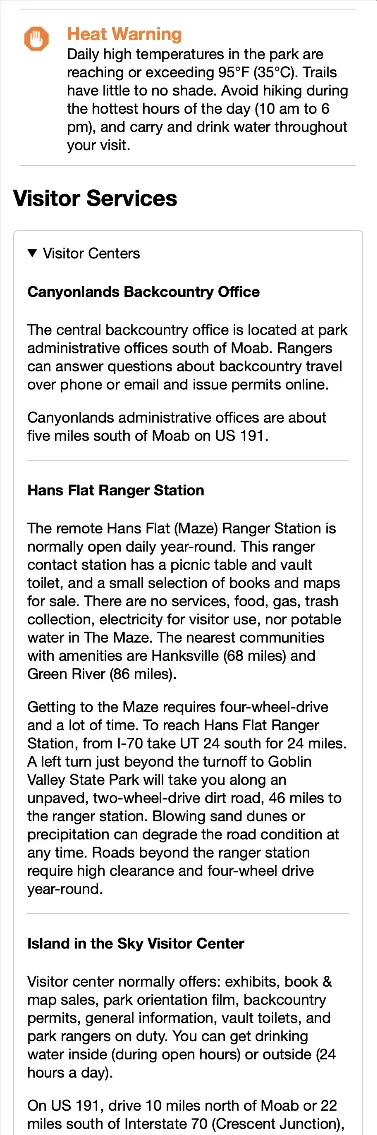
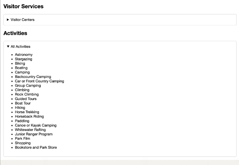
04 Visitor Services Section
Review the image below to see what the open Visitor centers section should look like.
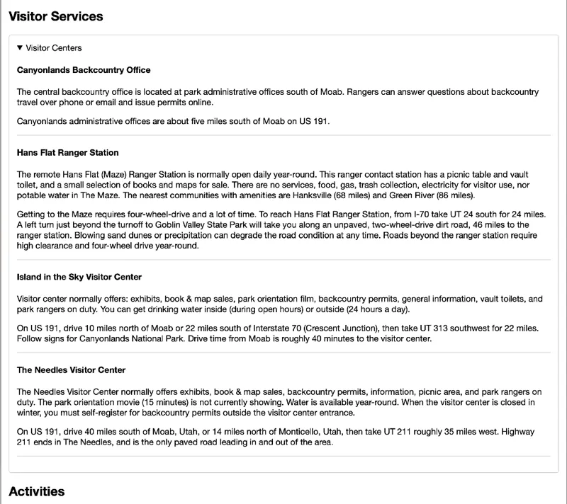
We will need to get this information from the API. Here is a list of steps to get you started.
- Create a new function in
parkService.mjscalledgetVisitorCenterData(parkCode). - Review the API docs to see what your URL should look like.
- Create a new template function to output each visitor center. Let’s output the
name,description, anddirectionsInfofor each center. - Use the
getVisitorCenterDatafunction inconditions.jsto get our data. - Create a new function in
conditions.jscalledsetVisitorCentersthat will use the template function with our list of centers and create and insert the HTML into our document just like we’ve done before. - Style the new section.
05 Activities Section
We already have the information for the activities section. It came with the general park info. Refer to the mockup below and complete it. The small screen is just a narrower version of the large in this case.
06 Check your build
We just made some changes to the structure of our site by adding a new HTML file. You probably don’t realize it yet, but those changes actually broke the production version of the site. Let’s take a look.
We can check the production build locally. If you run npm run build it will update the files in the dist directory. You should do this periodically to check to make sure nothing is broken!
The
distdirectory does not need to go to Github. You should also add that to your.gitignorefile.
Before moving on go ahead and run npm run build. We can get Vite to preview that build directory by running another command: npm run preview. Check to see what still works and what is broken. (You always need run npm run build before you run npm run preview after you have made any changes.)
When we made the changes to the product details page, we forgot to update Vite so that it knew about the changes. Let’s do that now.
Open up the vite.config.js file. Note the section that looks like this:
build: {
    outDir: "../dist",
    rollupOptions: {
      input: {
        main: resolve(__dirname, "src/index.html")
      }
    }
  }
We need to add our new page to this list so Vite knows about it. Modify that file like this:
build: {
    outDir: "../dist",
    rollupOptions: {
      input: {
        main: resolve(__dirname, "src/index.html"),
        conditions: resolve(__dirname, "src/conditions.html")
      }
    }
  }
Anytime we add or remove more .HTML files to the site we will need to update this config or the production version of our site will break!
We need to make one more change to fix our production site. Open dist/index.html and look for one of the SVG icons. Note the path. When we built that page we put /images/sprite.symbol.svg as the path. But in the dist/index.html it looks something like this: /assets/sprite.symbol-V3c65r7X.svg! What is going on?
One of Vite’s jobs is to manage assets. When it did it’s thing, it scanned the index.html file and saw the SVGs that we were using. It then copied the file into dist/assets/ and updated the path for us. There are a few reasons why it does this that we will not get into right now.
Now look at the /dist/conditions.html file and find the section that has the alert icons. Note the path. It still says /images/sprite.symbol.svg, but it needs to look for the file in dist/assets so the icons won’t show.
We need to let Vite know that it needs to manage those paths as well. We can do that by making the following changes to templates.mjs:
//add this at the top of the file
import spritePath from '../images/sprite.symbol.svg';

// ...bunch of stuff

export function alertTemplate(alert) {
  let alertType = "";
  // most of the alerts are one word and line up with the icons nicely. "Park Closure" is the exception
  switch (alert.category) {
    case "Park Closure":
      alertType = "closure";
      break;
    default:
      alertType = alert.category.toLowerCase();
  }
  // note the new path below for the SVG!
  return `<li class="alert">
  <svg class="icon" focusable="false" aria-hidden="true">
    <use xlink:href="${spritePath}#alert-${alertType}"></use>
  </svg>
  <div>
    <h3 class="alert-${alertType}">${alert.title}</h3>
    <p>${alert.description}</p>
  </div></li>`;
}
Run npm run build and npm run preview again and make sure everything is working.
07 Optimize
You may have noticed that in our style.css we include both home.css which contains styles that are only needed on index.html and conditions.css which is only needed on conditions.html. This seems a bit inefficient. It would be better if we only sent the CSS that would be needed for the current page. Since we have broken our CSS up into partials we can easily do that.
Open style.css and remove the imports for home.css and conditions.css. We will only leave CSS in the style.css that applies to all pages. One way we could include the page specific files would be to add another link element to each HTML file. This would certainly work, but because we are using Vite as a build tool we have a better option.
Open up conditions.js and add the following lines to the top:
import "../css/style.css"; // we can do this type of import because we are using Vite
import "../css/conditions.css";
…do the same in main.js only import in home.css instead of conditions.css
Then open up index.html and conditions.html and remove the link to the stylesheet.
When Vite does it’s thing it will notice those imports and see that they are not for Javascript. It will then grab the CSS and package it up. Then it will add the appropriate link elements to the HTML. Now we can easily have CSS that only applies to one page and not another.
08 Optional Stretch - Change the open/close indicator on the details boxes
If you look at the real NPS website you will see that the accordians have an arrow that points up or down depending on whether it is open or closed. And it is on the far right instead of the left. We can make this change to ours as well…but this step is optional.
If you want to give it a try check out this article 20 simple ways to style the HTML details element. Follow the instructions in the custom marker section.
You can use this url for the arrow image: https://byui-cse.github.io/wdd231-course/images/arrow.svg
09 Commit and push to Github
Commit your changes, then push them to GitHub. Wait a few minutes then check to make sure they show on Netlify.
Instructor’s Solution
As a part of this activity, you are expected to look over a solution from the instructor, to compare your approach to that one. One of the questions on the I-Learn submission will ask you to provide insights from this comparison.
Please DO NOT open the solution until you have worked through this activity for at least one hour. At the end of the hour, if you are still struggling with some of the core requirements, you are welcome to view the instructor’s solution and use it to help you complete your own code. Even if you use the instructor’s code to help you, you are welcome to report that you finished the core requirements, if you code them up yourself.
After working as far as you can, click here for the instructor’s solution.