NPS - part 1
Time: 2 hours

Yellow: Instructor-Specified AI Usage
You may use AI as described in the assignment with the appropriate attribution.
AI can be used to help you with this assignment, but you should not rely on it too heavily. Use it to help you understand concepts, troubleshoot or get unstuck, or generate ideas. Do not use it to generate large amounts of code. If you do use AI, make sure to validate what it tells you with other sources.
Instructions
Complete the following assignment individually. Feel free however to work together with your classmates to accomplish the task. You are all solving the same problems and have different insights.
01 Review the provided project files and code
Begin by opening up the NPS project you cloned to your computer during the previous activity. Open the package.json file. This file is the blueprint for the project. It lists the tools and libraries the project will use, and has a section with some scripts to make common commands easy to run.
There is currently only one tool, or dependency in our project currently: Vite. This tool is called a bundler. It has the ability to run different processes on our files to get them ready for production. It also has a development web server built into it. We will use this server instead of the one provided by the Live Server extention you are probably familiar with to preview our changes.
Open up the src folder and take a look at the files there. This is where the code we write will live. There are already a couple of javascript files, a CSS file, and an index.html. You will rarely be making any changes outside of this folder.
Before we can view the site we have to actually install the tools we said we need. Open a command prompt in VS Code and type the following dir if you are running windows, or ls if you are on a mac. In the files that are listed you should see the package.json if you don’t see that you need to change directories until you get the right one.
Then type: npm install. This looks at the list of dependencies in the package.json file and installs them into the project. It will create a new directory called node_modules. You can delete that folder at any time and rebuild it with the command above.
Finally type npm run start. This will start up our development environment and should open the page in your default browser. (If the page doesn’t open automatically then find the line in your terminal that says: http://localhost:5173/ and click on it while holding cmd on the Mac or ctrl on the PC)
02 Finish the HTML
Open up the index.html file. You see a fair amount of code in there already. Below is a summary of the major sections provided:
<body>
    <p class="disclaimer"></p>
    <div class="skip-links" aria-label="short-cut links" role="navigation"></div>
    <header>
      <section class="global-header"></section>
      <section id="park-header"></section>
    </header>
    <main id="main"></main>
    <footer id="park-footer"></footer>
  </body>
If you go to the page in the browser, click on the URL then hit tab a couple times you will see the purpose of the section with the class skip-links This is to make navigating the site easier for folks who use a keyboard instead of a mouse. Check out the CSS file to see how that is hidden and shown.
Notice that there are two headers as well. Open up the real page for Yellowstone National Park. The first header (global) is the same across all NPS websites. The other header is specific to the park.
The page has a unique way of providing the icons as well. If you look inside the global-header you will see something that looks like this:
<svg class="icon">
    <use xlink:href="/images/sprite.symbol.svg#search"></use>
</svg>
The icons are all svgs and can be found in the file images/sprite.symbol.svg. Look through that file to see what icons you have access to. This course is not going to dive deep into SVGs, but this provides an example of one way they can be used.
You have probably never used an
<svg>element before. SVG is an image file format. It stands for “Scalable Vector Graphic”. One nice thing about them for the web is the “scalable” part. We can make them as big or as small as we want with no loss in quality. Another nice thing is that we can gather lots of SVG icons together in one file…likesprint-symbol.svgthen to use them we just need to look up theidof the icon we want in the file, then put it in the code below to display it:<svg class="icon"><use xlink:href="/images/sprite.symbol.svg#ICON_ID_HERE"></use></svg>
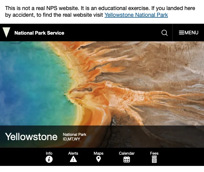
The next step is to finish writing the HTML for both headers: the global and the park. Refer back to the real website as you do this. See the following image to see what your page should look like when you are done with this week. Just hard code the values for the park name etc for now. We will change that later.
Note! You do not need to build the menu that is shown when you click the Menu button this week.
Once you have completed this step feel free to review the instructor’s code. Don’t just copy and paste this into your file! Review it, note the differences, and then add or remove whatever you think appropriate once you understand what the differences mean.
Click here to see the instructor’s code
<header>
    <section class="global-header">
    <a href="index.html" class="site-title"
        ><span class="logo" role="presentation"></span>
        <h1>National Park Service</h1></a
    >
    <div class="global-header__right">
        <a class="search-icon" href="#park-footer">
        <svg class="icon">
            <use
            xmlns:xlink="http://www.w3.org/1999/xlink"
            xlink:href="/images/sprite.symbol.svg#search"
            ></use>
        </svg>
        <span class="visually-hidden">Search</span>
        </a>
        <button id="global-nav-toggle">
        <svg class="icon">
            <use
            xmlns:xlink="http://www.w3.org/1999/xlink"
            xlink:href="/images/sprite.symbol.svg#menu"
            ></use>
        </svg>
        <span class="visually-hidden">Open</span> Menu
        </button>
    </div>
    </section>
    <section id="park-header">
    <div class="hero-banner">
        <img src="" alt="" />
        <div class="hero-banner__content">
        <a href="#" class="hero-banner__title">Yellowstone</a>
        <p class="hero-banner__subtitle">
            <span>National Park</span>
            <span>ID, MT, WY</span>
        </p>
        </div>
    </div>
    <nav class="park-nav">
        <ul>
        <li>
            <a href="#">
            <span>Info</span>
            <svg class="icon" role="presentation" focusable="false">
                <use
                xmlns:xlink="http://www.w3.org/1999/xlink"
                xlink:href="/images/sprite.symbol.svg#info"
                ></use>
            </svg>
            </a>
        </li>
        <li>
            <a href="#">
            <span>Alerts</span>
            <svg class="icon" role="presentation" focusable="false">
                <use
                xmlns:xlink="http://www.w3.org/1999/xlink"
                xlink:href="/images/sprite.symbol.svg#alert"
                ></use>
            </svg>
            </a>
        </li>
        <li>
            <a href="#">
            <span>Maps</span>
            <svg class="icon" role="presentation" focusable="false">
                <use
                xmlns:xlink="http://www.w3.org/1999/xlink"
                xlink:href="/images/sprite.symbol.svg#location"
                ></use>
            </svg>
            </a>
        </li>
        <li>
            <a href="#">
            <span>Calendar</span>
            <svg class="icon" role="presentation" focusable="false">
                <use
                xmlns:xlink="http://www.w3.org/1999/xlink"
                xlink:href="/images/sprite.symbol.svg#calendar"
                ></use>
            </svg>
            </a>
        </li>
        <li>
            <a href="#">
            <span>Fees</span>
            <svg class="icon" role="presentation" focusable="false">
                <use
                xmlns:xlink="http://www.w3.org/1999/xlink"
                xlink:href="/images/sprite.symbol.svg#fee-22"
                ></use>
            </svg>
            </a>
        </li>
        </ul>
    </nav>
    </section>
</header>
03 Begin Styling
Open up the style.css file. Note you were given some CSS to get you started. All those custom properties were taken from the actual site. You won’t need all of them, but they should prove helpful as you style. Refer back to the real site often as you are styling. Your goal is to make it as close as possible. Below are a few things to note:
- You should resize your browser to be narrow…like a mobile screen. You can do this either through the developer tools, or just by changing the width of your browser
- Start with the global styles. What font should be used for the body copy and headlines? What color(s) should links be? Should the base font size be increased? (yes!), etc
- Your fonts and colors can be found in the custom properties at the top of the file. Use them!
- It would be good to add a rule to make our images responsive. We never want an image to be bigger than the space it has available. So you will see that a rule has been added to make this happen.
- You will probably need to use both flexbox and grid to accomplish the layout.
- For now to get the styling done, use
https://www.nps.gov/common/uploads/structured_data/3C7D5920-1DD8-B71B-0B83F012ED802CEA.jpgfor the banner image. If the sizing is giving you trouble…check out theobject-fitproperty. - Once you get the background colors set you can get rid of the rule at the bottom:
svg
Continue adding css until your page matches the screenshot above.
Once you have completed this step feel free to review the instructor’s code. Don’t just copy and paste this into your file! Review it, note the differences, and then add or remove whatever you think appropriate once you understand what the differences mean. Your sizes and spacings may not match mine exactly…that is ok. I didn’t match the original perfectly.
Click here to see the instructor’s code
/* Global navbar styling */

.global-header {
  background-color: var(--bs-black);
  color: white;
  display: flex;
  justify-content: space-between;
  fill: white;
}

.global-header a:link,
.global-header a:visited,
#park-header a:link,
#park-header a:visited {
  color: white;
  text-decoration: none;
}
.global-header .icon {
  width: 20px;
  height: 20px;
}

.global-header__right {
  display: flex;
  align-items: center;
}
.global-header__right .search-icon {
  padding: 0 1rem;
  margin-top: 6px;
}
.global-header__right button {
  background-color: transparent;
  border: none;
  color: white;
  font-size: 1rem;
  padding: 1.2em;
  display: flex;
  align-items: center;
  text-transform: uppercase;
  border-left: 1px solid var(--bs-grey-5);
}

/* Hero banner */
.hero-banner {
  display: grid;
  grid-template-columns: 1fr;
}
.hero-banner > img {
  width: 100%;
  height: 350px;
  object-fit: cover;
  grid-column: 1/2;
  grid-row: 1/3;
}

.hero-banner__content {
  background-color: rgba(0, 0, 0, 0.7);
  color: white;
  grid-column: 1/2;
  grid-row: 2/3;
  display: flex;
  align-items: center;
  gap: 1em;
  padding: 0.5em 1em;
}

.hero-banner__title {
  font-size: 1.8em;
}

.hero-banner__subtitle {
  display: flex;
  flex-direction: column;
  font-size: 0.8rem;
}
/* Park nav styling */

.park-nav > ul {
  list-style: none;
  padding-left: 0;
  margin: 0;
  display: flex;
  justify-content: center;
  background-color: var(--bs-black);
  font-size: 0.8rem;
}
.park-nav a {
  display: flex;
  flex-direction: column;
  align-items: center;
  justify-content: center;
  padding: 0.8em 2em;
}
.park-nav a:hover {
  background-color: rgba(255, 255, 255, 0.3);
}
.park-nav svg {
  width: 24px;
  height: 24px;
}
04 Make it dynamic
The last step is to dynamically load in all the info specific to this park. For this week we will be using data provided in a file called js/parkService.mjs Open that file up now. It has information about Yellowstone National Park, and so we will all make that site for now. Starting with part 2 however you will be able to choose any park you want!
If you have never seen the file extension
.mjsbefore, it indicates that the file is an ESModule. Modules are commonly used to organize code and make it more reusable. There should always be at least one thing that is exported from a module. We can use those exported things by importing them.For example, in the
parkService.mjsfile there is a function that looks like this:export function getParkData() { return park; }If we wanted to use that function in another file, like
main.jsfor example we would do the following:import { getParkData } from './parkService.mjs'; const parkData = getParkData();After importing the function we can use it just like as if it were declared in the file.
You should see a large javascript object, and a function that is exported that just returns the object.
Now open up js/main.js. You will notice that the function is imported so we can use it. In fact it is already being called and the results set into a variable called parkData.
To finish we need to use the DOM methods to select each part of the page that needs dynamic data, then pull the appropriate data out of the variable. Let’s make a list!
- Update the link in the disclaimer area to read the name of the park and navigate to that park’s official site.
- Update the title of the page to read the name of the park.
- Use the first image in the list in the data for the hero image.
- Update the name, designation, and states of the park in the hero.
As a review we will do the first one together.
Remember that to manipulate any HTML element we first have to use the DOM methods to select it into our Javascript code. Commonly we use document.querySelector to do this. To update the link in the disclaimer we can use the .disclaimer selector (but remember to target the a inside of the .disclaimer), then we need to update two things: the href with the URL and the innerHTML with the name of the park. Review the following code:
const disclaimer = document.querySelector(".disclaimer > a");
disclaimer.href = parkData.url;
disclaimer.innerHTML = parkData.fullName;
For the name, designation, and states of the park you could select each of those independently, or we could just create a simple template function and build it all at once. That function would look like the following:
function parkInfoTemplate(info) {
  return `<a href="/" class="hero-banner__title">${info.name}</a>
  <p class="hero-banner__subtitle">
    <span>${info.designation}</span>
    <span>${info.states}</span>
  </p>`;
}
Finish the last two items on your own.
05 Commit and push to Github
Commit your changes, then push them to GitHub. Wait a few minutes then check to make sure they show on Netlify.
After verifying that your page updated, make sure that you submitted the correct URL in the Microsoft Teams Channel. You should have done this in the course setup activity
Instructor’s Solution
As a part of this activity, you are expected to look over a solution from the instructor, to compare your approach to that one. One of the questions on the I-Learn submission will ask you to provide insights from this comparison.
Please DO NOT open the solution until you have worked through this activity for at least one hour. At the end of the hour, if you are still struggling with some of the core requirements, you are welcome to view the instructor’s solution and use it to help you complete your own code. Even if you use the instructor’s code to help you, you are welcome to report that you finished the core requirements, if you code them up yourself.
After working as far as you can, click here for the instructor’s solution.