Responsive Images: srcset
Overview
We have worked with basic image optimization using image types, sizing, and quality level adjustments. We also want to be aware of the image's appearance in different screen sizes. The work of responsive image design is to support smaller page weights and to deliver content based upon screen size. The goal is to reduce page weight while being conscious of image clarity and functionality in each screen size and subsequent viewport (the visible area of a web page).
Prepare
The user experience (UX) concept here is that users expect to scroll web pages vertically with no need to scroll horizontally to view content. Nor should the user should be required to zoom in or out to see the page content. We cannot expect nor rely upon on a particular viewport width in order for the page to render properly.
This activity focuses on applying the srcset attribute to images using the picture and source elements. The activity content assumes the following:
- The viewport meta element has been properly applied to the document.
- The images to be used have been optimized for the web by
- Limiting the images' width and height (dimensions) to no more than is necessary for the page design in all view sizes.
- The images are of a valid web type/format.
- The images are compressed to reduce their overall file size. In many image editing software packages this is referred to as reducing the 'quality'.
- The developer has designed images to be use for different screen sizes. Art
Direction is the cropping and dimensional sizing of images to focus the user's
attention on a specific part of the image to meet the design objectives of the page in
different view sizes.
Read: 📄 Art Direction - MDN
Srcset supports the need to target different browser ranges. A different image can be rendered depending up on the width of the screen. Here is an example:
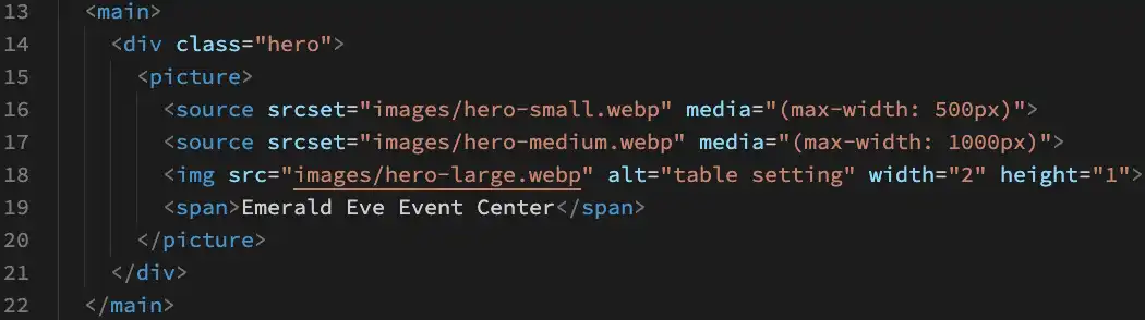
The picture tag (line 15 and 20) has a reference to three different images, two sources on line 16-17 and the default img tag on line 18. Let's start at the top and work our way down.
Line 16: Is the width of the browser narrower than the max-width of 500px? If so, the srcset path from the line 16 replaces the src from the img tag (line 18) and the smallest image is displayed. If the browser is wider than 500px then we move on to the next test.
Line 17: Is the width of the browser narrower than the max-width of 1000px? If so, the srcset path from the line 17 replaces the src from the img tag and the middle image is displayed.
Line 18: This the default. Since the browser window is wider than 500px and wider than 1000px, this referenced image will be rendered.
Activity Instructions
File and Folder Setup
- If it does not already exist, create a folder named "week03" in the wdd230 directory.
- Add a new file named "responsive-images.html" to that week03 folder.
- Provide a basic HTML structure to the responsive-images.html file.
- If it does not already exist, add a "styles" folder to the week03 folder and add a new CSS file named "responsive-images.css" to that styles folder.
- If it does not already exist, create a folder named "images" in your week03 directory.
Image Editing
- Navigate to Temple List and click on a temple link of your choice to gain access to that temple's Media Gallery.
- In the Media Gallery of the temple, click on one of the images and download a Large version of the image by using Save Image As... or equivalent method.
- Using your image editing, like Pixlr E,
load the downloaded image file and create three (3) different images:
- Each image should have a different crop (Art Direction)
- Save all three images in the WebP file format with a quality around 50%.
- Create a small version named "hero-small.webp" that is 500px in width by 250px in height.
- Create a medium version named "hero-medium.webp" that is 1000px in width by 500px in height.
- Create a large version named "hero-large.webp" that is 1500px in
width by 750px in height.
Note that the ratios of all these images are 2:1 for consistency.
- Put all of these images in your images folder for week03.
HTML: Picture Element
- In your html file, add a
mainelement with a generic division element with the class of "hero - Within the
divelement, add apictureelement. - Within the
pictureelement, add asourceelement with attributes formediaandsrcsetEmmet Shorthand (enter syntax + tab):main>div.hero>picture>source:media*2+img - Set the path for the srcset to the smallest image.
- Set the media attribute to
max-width: 500pxwhich is the width of the small hero image created earlier. - If needed, copy and paste the source line of markup and then change the image to the
medium image and the max-width to 1000px.
Neither of these images will render on a page. An
imgelement with asrcis needed. - Add the
imgelement with a src referencing the largest image. - Set the
altattribute value to a description of the image. - Set the
widthandheightattributes to the width and height of the largest image. What should the values for width and height be since we have a 500px by 250px photo and a 1000px by 500px photo and a 1500px by 750px photo? The important point is to maintain the aspect ratio of the image as the ratio is used by the browser to render the space required by the image once it loads. We can use the large image of 1500 and 750 or any equivalent ratio.
Example
      <div class="hero">
  <picture>
    <source srcset="images/hero-small.webp" media="(max-width: 500px)">
    <source srcset="images/hero-medium.webp" media="(max-width: 1000px)">
    <img src="images/hero-large.webp" alt="table setting" width="1500" height="750">
  </picture>
</div>
Some of the most common causes of a layout shift or reflow during the rendering of a page are images, ads, embeds, and iframes without dimensions. "Layout shifts can be distracting to users. Imagine you've started reading an article when all of a sudden elements shift around the page, throwing you off and requiring you to find your place again. This is very common on the web, including when reading the news, or trying to click those 'Search' or 'Add to Cart' buttons. Such experiences are visually jarring and frustrating. They're often caused when visible elements are forced to move because another element was suddenly added to the page or resized."
Optimize Cumulative Layout Shift - Osmani and Pollard, web.devCSS:
- In the style sheet, enable responsive behavior on the image by setting the
widthof the img element to 100% and theheighttoauto(or vice-versa). This is the easiest way to maintain the image aspect ratio.Example
.hero img {
  width: 100%;
  height: auto;
}
Submission
- Update your course home page with a link to this activity.
- Always remember to commit and push (upload) your work to your wdd230 GitHub Pages repository.
Additional Resources
- 🎦 Working with Responsive
Images
(6:49 mins, Responsive Images Transcript) - 📄 Serve Responsive Images - Katie Hempenius -
dev.to
- Aspect-Ratio CSS Property - Una Kravets - web.dev