Responsive "Hamburger" Menu
Overview
The purpose of this activity is to build a responsive menu using JavaScript to respond viewport size and to a ≡ 'hamburger button' click. Our goal in any responsive design is to implement favorable user experiences and operations with which the user is familiar.
Prepare
"Hamburger menus" or equivalent structures support responsive design. They allow us to clean up layouts because they save space on the page. They are well-recognized by users, even if they may not know that the symbol is called a "hamburger menu".
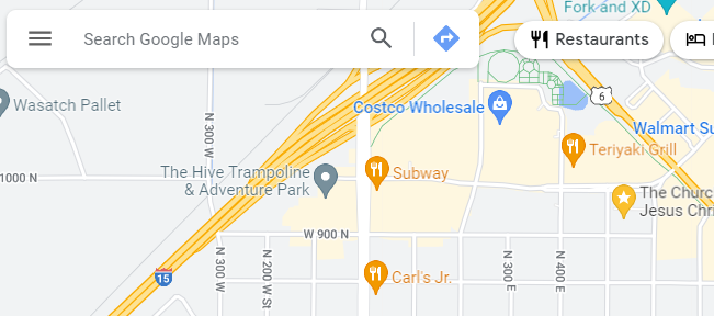
Here is an example from Google Maps.
- Watch this example application of a responsive menu in this video demonstration:
- 🎦 Responsive 'Hamburger' Menu
- ⚙️CodePen source: Responsive Menu
Activity Instructions
- In your own CodePen account, fork (copy) this ⚙️CodePen: Responsive Menu - Start
- CSS: Move the hamburger menu button to the right upper corner of the screen by supplying appropriate CSS declarations where there are currently blanks (______).
- JavaScript: Complete the JavaScript code by filling in the three (3)
blanks (______) within the menu button event listener.
This example listens to a user initiated event and toggles the given class for the navigation element. The class name already exists in CSS and is ready to be applied.
- CSS: Change the hamburger button closing icon to ✕ or ❎ or something of your
choice that would be appropriate for your design.
What does the
::syntax in the CSS rule selector do?The syntax selects a pseudo-elements to the selected element which in this case, allows us to add content to the existing content in the element.
- CSS: Wayfinding - Add a rule for the "active" class to
let the user know what page they currently have open by visually changing the appearance of
the one menu item.
In this example theactiveclass is being applied to the About page.<a href="#" title="About Us" class="active">About Us</a>"Making it easy for people to navigate around a website or application helps everyone find what they need quickly and effectively. Clear wayfinding especially helps people with visual, mobility, or cognitive impairments who may otherwise find it difficult to understand where they are and how to get where they want to go." - Harvard University - Digital Accessibility - Be sure to Save your changes on your CodePen.
⚙️CodePen: Example Solution
Submission
- Update your course portal page with a link to your CodePen in Week 2.
- Commit and Push you updates to your wdd230 GitHub Pages repository.