CSS Media Queries
Overview
CSS Media Queries are used to provide alternative CSS declarations for rendering content in different viewports. Web designers use media queries to decide when a design or layout change/transformation is needed based upon the site content. Web developers code breakpoints based upon conditions such as a minimum viewport width to meet the intent of the design.
- How to choose breakpoints - Responsive Web - Google Web Fundamentals
Prepare
CSS media queries are essential to responsive web design. The @media at-rule specifies
condition(s) to create a block of CSS rules that are applied if the condition(s) evaluates to
true. This is extremely useful as selected elements can be repositioned, resized, hidden,
exposed,
etc. based upon the user's viewport size.
Here is the general syntax is setting up a CSS
@media query:
@media not|only mediatype and (expressions) {
  /* CSS rules go here inside the @media query's opening and closing curly brackets {} */
}
Here is an example CSS media query which could be embedded in a CSS file or be the entire contents of a CSS file if wanted. This example only has one CSS rule.
@media screen and (min-width: 640px) {
  h1 {
    font-size: 2.5rem;
    margin: 1rem;
    color: navy;
  }
}1️⃣ The @media screen and (min-width: 640px) {is the signature
line of the @media query block of CSS rules to be applied if the conditions are met. In this
case
the conditions are if the media type is a screen and the viewport minimum width is at least
640
pixels wide.
2️⃣ The h1 {is a heading 1
(<h1>) element selector which starts the defined CSS rule.
3️⃣-5️⃣ The @font-size: 2.5rem; margin: 1rem; color: navy; are
declarations to be applied to any <h1> elements if the @media query
conditions are met.
6️⃣ The first }closes the CSS rule for <h1> code elements.
7️⃣ The last }closes the media query.
Design Considerations: The Viewport
(13:30 minutes - Transcript - Designing for a Viewport Transcript)
Activity Instructions
File and Folder Setup
- Add a new HTML file named "media-query.html" in the lesson02 folder.
- Add two CSS files to the lesson02 styles folder named "media-query.css" and "media-query-large.css".
HTML
- In your media-query.html file, create a valid HTML page with standard
head content including
- Meta Charset Attribute
- Meta Viewport Element
- Title Element
- Meta Description Element
- Meta Author Element
- Link to a Google Font named "Roboto".
- Link references to your CSS files. Link the media-query.css file first.
Example
<head> <meta charset="utf-8"> <meta name="viewport" content="width=device-width, initial-scale=1.0"> <title>WDD 230 - Media Query Example</title> <meta name="description" content="Media query learning activity example page."> <meta name="author" content="[Put your full name here]"> <link rel="preconnect" href="https://fonts.googleapis.com"> <link rel="preconnect" href="https://fonts.gstatic.com" crossorigin> <link href="https://fonts.googleapis.com/css2?family=Roboto&display=swap" rel="stylesheet"> <link rel="stylesheet" href="styles/media-query.css"> <link rel="stylesheet" href="styles/media-query-large.css"> </head> - In the body of the HTML document, add a header with an
h1, a main element with two section
elements, and a footer element.
- The h1 element should contain the words "Media Query Example".
- Each section h2 heading contains a scripture with book, chapter, and verse.
- The section paragraph contains a copy of the actual scripture referenced in the heading.
- The footer should contain your name.
Example
<header>
  <h1>Media Query Example</h1>
</header>
<main>
  <section>
    <h2>2 Nephi 32:9</h2>
    <p>But behold, I say unto you that ye must pray always, and not faint; that ye must not perform any thing unto the Lord save in the first place ye shall pray unto the Father in the name of Christ, that he will consecrate thy performance unto thee, that thy performance may be for the welfare of thy soul.</p>
  </section>
  <section>
    <h2>Helaman 12:24</h2>
    <p>And may God grant, in his great fulness, that men might be brought unto repentance and good works, that they might be restored unto grace for grace, according to their works.</p>
  </section>
</main>
<footer>
  [Your Full Name Here]
</footer>
CSS
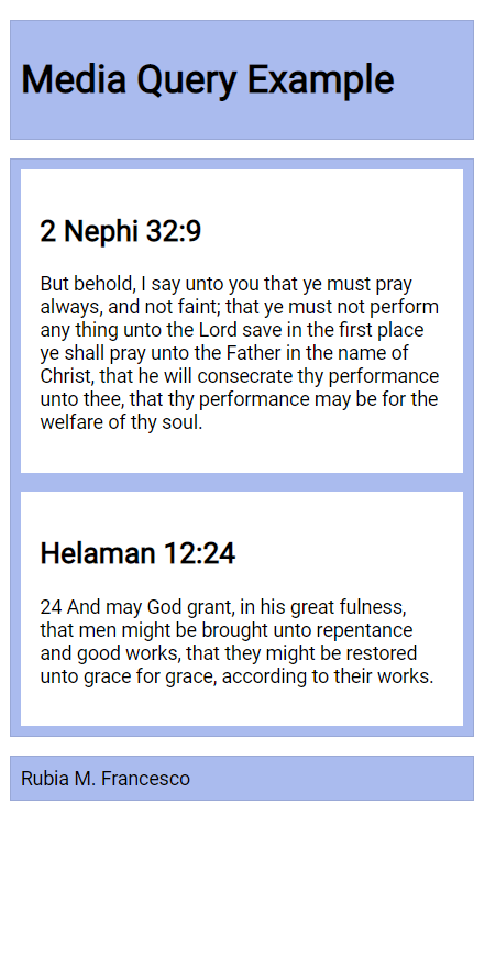
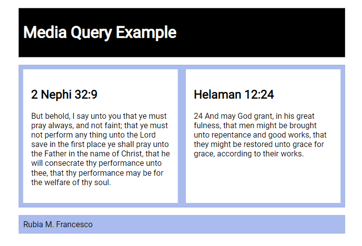
- Style the document as shown in the example screenshots given below.
- In the media-query.css,
- do not include a media query,
- use the Google Font - Roboto in the body rule,
- the header, main, and footer each
- have a maximum width of 640 pixels
- are centered on the page using
margin: 1rem auto - include a faint border and appropriate padding
- have a blueish background color of your choice
- set the main element to be a CSS grid with a grid template of only one column, and
a equal gap of 1rem, and
If you had a question to pose to the class in MS Teams or to your group, use specific language like: "I have a question about the media-query assignment part 5.1.4. I do not know how to set the main element grid to only one column with an even gap of 1rem."
- set the section elements to also have padding and a white background.
Example
body {
  font-family: 'Roboto', sans-serif;
}

header, main, footer {
  max-width: 640px;
  margin: 1rem auto;
  border: 1px solid #bbb;
  padding: 1rem;
  background-color: #e6f2ff;
}

main {
  display: grid;
  grid-template-columns: 1fr;
  grid-gap: 1rem;
}

section {
  padding: 1rem;
  background-color: #fff;
}
- In the media-query.css,
- In the media-query-large.css,
- write a containing media query to be applied at a viewport width of 500px or greater.
@media screen and (min-width: 500px) - change the header to a black background with white text, and
- change the main element to display two columns of equal size.
Hint
grid-template-columns: 1fr 1fr;
- write a containing media query to be applied at a viewport width of 500px or greater.
Example Screenshots


Testing
- Always test your work and validate your code.
Submission
- Commit and push (upload) your work to your wdd230 GitHub Pages enabled repository.
- Your home portal page build assignment this week will ask you to link to each learning activity.