This assignment applies the concepts presented in the learning activities to a picture
album page that is responsive in both small and larger views. This page will utilize a
'hamburger' menu and respond to user interaction.
Associated Course Learning Outcomes
Develop responsive web pages that follow best practices and use valid HTML and CSS.
Demonstrate proficiency with JavaScript language syntax. Use JavaScript to respond to
events and dynamically modify HTML.
Task
Design, develop, test, and deploy a temple album page using your own selection of
temple pictures.
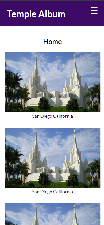
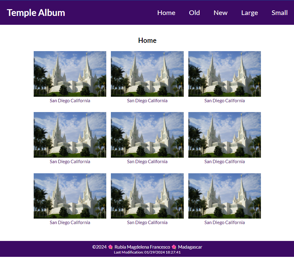
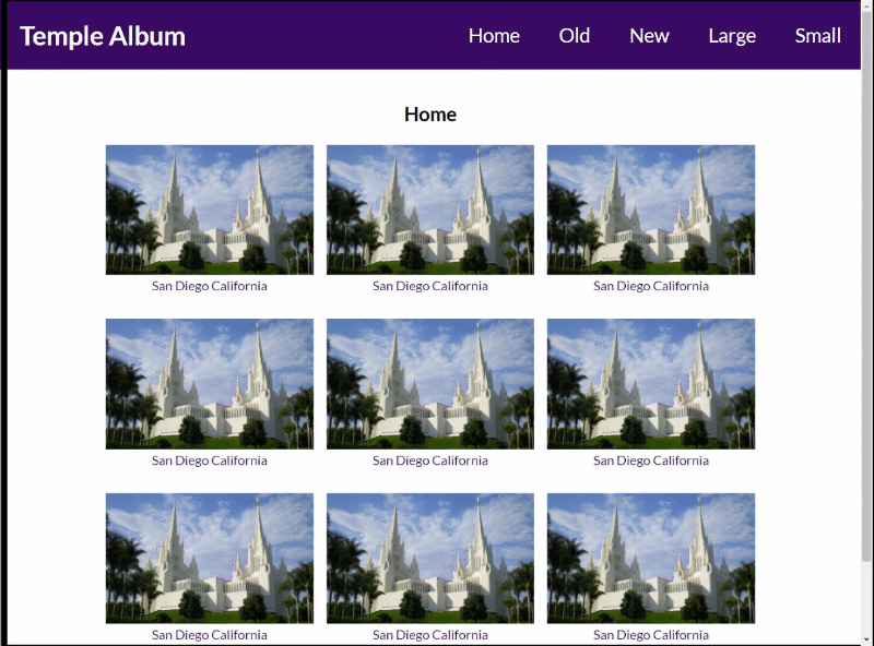
Screenshot Example in Mobile ViewScreenshot Example in Larger ViewDemonstration of Responsive Behavior
Instructions
File and Folder Setup
In VS Code, open the wdd131 local repository folder.
In the root folder (wdd131), create a new file named "temples.html".
Add two CSS files named "temples.css" and "temples-large.css" to the
styles directory.
Add a JavaScript file named "temples.js" to the scripts directory.
HTML
In the temples.html document, include the standard HTML document and
<head> elements.
Add links to the CSS files in the proper order to support mobile-first development.
Add a deferred <script> reference to the JavaScript file.
In the <body>, create a basic layout using a header, a
main, and a footer as main-level elements.
The <header> element contains:
text that says "Temple Album"
a <nav> menu with the following text links:
Home
Old
New
Large
Small
The <main> element contains the following:
an <h1> heading element
at least (9) <figure> elements with temple images and captions. Use the built-in
figcaption element to name each temple.
It is OK to use a single placeholder temple image at this point in the course.
The <footer> contains the same dynamic and static information found on
your home page from last week.
Screenshot Example of Common Footer
CSS
Use the external temples.css and temples-large.css files to lay out and style
the
page as shown in the example screenshots. Your design must support a responsive view in both mobile and larger
views.
The temples.css file is used for the mobile view, and the temples-large.css
file is used for the larger view. Most of your CSS should be located in the temples.css file
in mobile-first design.
Use your own color scheme.
Please note: You are responsible to practice good design principles of alignment, color
contrast, proximity, repetition, and consistent white space.
Use your own typography choice by using the Google Fonts API service to select one or two fonts to use on the page.
The navigation must employ a hover effect. See the CodePen
above for an example.
Check Your Understanding
Consider using the hover pseudo-class to change the design for the menu item that has the focus.
nav a:hover { ... }
The main element has a limited width and is centered on the screen
horizontally.
Check Your Understanding
Consider using the max-width property to limit the width and margin property to
center the main element on the screen.
/* This is only an example to consider */
main {
  max-width: 800px;
  margin: 0 auto;
}
Layout the main column figure elements using CSS Grid. In
the mobile view, there should only be one (1) column.
The application of CSS Grid to support a responsive view is up to you.
Some of the options include:
Use grid-template-columns with specific fr changes in the media
query.
Use grid-template-columns property with a repeat function and
auto-fit and minmax function.
To improve organization and maintainability, it is required to place all JavaScript code in external files.
Support the footer copyright year and last modified date output using JavaScript.
You can use an existing JavaScript file or create the new temples.js file.
Apply a responsive hamburger effect to your existing navigation menu using JavaScript.
The hamburger button should only show in the mobile view.
Clicking the hamburger button toggles the navigation menu items from viewable to not viewable.
Use a symbol, such as an 'X' to close the hamburger menu.
Testing
Continuously check your work by rendering the page locally using the Live Server or Five Server extension in
VS Code.
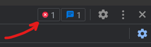
Use the browser's DevTools to check for JavaScript runtime errors in the Console tab,
or
click the red error icon in the upper right corner of DevTools.
Use DevTools CSS Overview to check your color contrast.
Generate the DevTools Lighthouse report and run diagnostics for
Accessibility, Best Practices, and SEO in both the
mobile and desktop views.
It is best to test your page in a Private or Incognito browser window.
Hard reload the page using Empty Cache and Hard Reload in DevTools with the
Network tab open to view the total transferred bytes at the bottom of the tab. Verify that the
page is 500 kB or less.
Make sure all images are optimized.
Do not use third-party libraries that bloat your page's size with unused features and code.
Audit and Submission
Commit your local repository and push or upload your work to your GitHub Pages enabled wdd131
repository on GitHub.
Use this ✔ Page Audit
Tool to check basic HTML and CSS
standards and requirements.
Share your work by posting your URL in the course's Microsoft Teams Week 02
Forum, and provide constructive feedback on your peers' work.
Return to Canvas and submit the correct GitHub Pages enabled URL.