W01 Learning Activity: HTML and CSS Review
Overview
This learning activity reviews HTML and CSS layout principles with a focus on core layout design and development. Mastering the workflow process—writing code in VS Code, testing, committing, and pushing your work to your GitHub repository—is critical to your success in this course.
Task
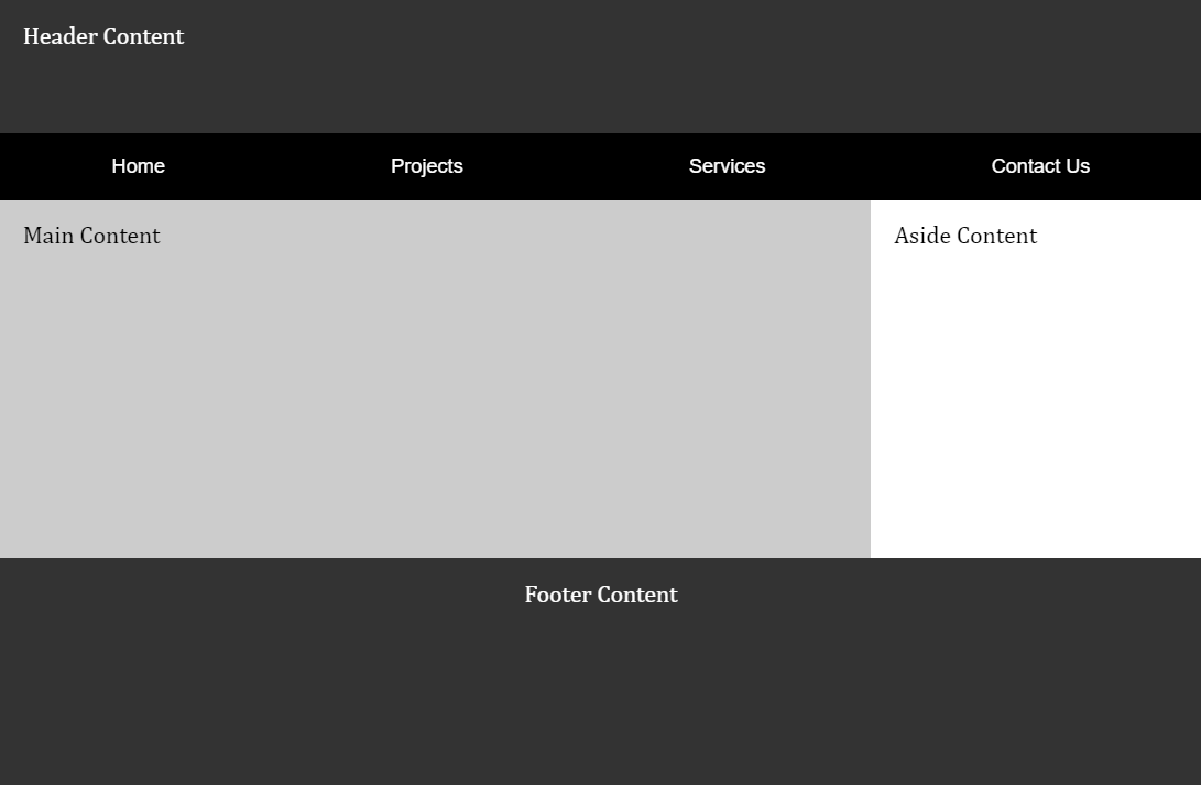
Create the following layout using placeholder content for text and images.

Associated Course Learning Outcome
Develop responsive web pages that follow best practices and use valid HTML and CSS.
Prepare
- Watch: The holy grail layout demonstration video (7:45-10:03) ▶️ 10 Modern Layouts – Google
Chrome
Developers – [ 2.5 minutes ]
This CodePen ☼ Holy Grail Layout – Google WebDev supports the coding exercise in the video segment.
- Review: CodePen ☼ Navigation Menu using CSS Flex
Activity Instructions
This activity has an associated Audit Report to assist your development.
File and Folder Setup

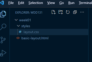
- In VS Code, add a new subfolder named "week01" within your
wdd131local repository folder. - Add a file named "basic-layout.html" to the
week01folder. - Add a new subfolder within the
week01folder named "styles". - Create a supporting, external CSS file named "layout.css" and place it
in the
stylesfolder.
HTML
- In the
basic-layout.htmlfile, use semantic HTML to support the given layout.Consider using an Emmet shortcut in VS Code by typing
html5or just an!and then pressing the Tab key in a blank HTML document. This action will generate a core HTML structure. - Ensure that your navigation element is placed within the
headerelement. - Include the placeholder content (e.g., "Header Content").
- Link the external CSS file.
- Always use appropriate
titlecontent. In this assignment, include your name and WDD 131.
CSS
- Use CSS Grid on the body of the document to support the given layout.
Typically, you should avoid using Grid on the
<body>element because it makes it harder to override styles for specific sections and complicates maintainability with more complex layouts. If you need to use Grid for the body content, consider using a separate container element and applying Grid to that container. However, this activity's website has a straightforward structure with clearly defined sections, so using Grid on the<body>is an efficient choice. - Use CSS Flex on the navigation menu.
- The color scheme and font family are your choice.
Test Page
- Check your work by loading your page into your browser using Live/Five Server through VS Code.
- Validate your HTML and CSS.
- Use DevTools Lighthouse for a deeper dive into your page's performance, accessibility, and
adherence to best practices.
"DevTools" is an abbreviation for "Developer Tools." It refers to a set of tools or utilities provided by web browsers to help developers debug, profile, and analyze web pages during development. These tools are typically accessed by pressing the F12 function key or selecting the menu option for the browser's developer tools.
– What are browser developer tools? – MDN
Check Your Understanding
- Commit and push your work to your GitHub Pages repository.
- Wait a few minutes for the server to update, then check how your page renders in a browser.
Does it look like the example screenshot above? If not, make corrections and push your changes.
What is the GitHub Pages enabled URL to your page?
https://yourgithubusername.github.io/wdd131/week01/basic-layout.html - Discuss issues with your peers and the instructor in the Microsoft Teams Week 01 Forum channel.
- Continue to make corrections and adjustments as needed and remember to commit and push your changes.
