W05 Learning Activity: Styling Forms
Overview
An HTML form is a user interface that needs styling to be usable and provide a positive user experience. In this activity, you will add CSS to the User Poll form built in the previous activity.
Prepare
- Read: 📄 Styling web forms – MDN
- Review: 📄 Best Practices for Form Design – Adobe
Activity Instructions
Using the User Poll form from the previous activity, add CSS to align it with best practices for form design, such as a single-column layout and appropriate padding and spacing in and between form elements.
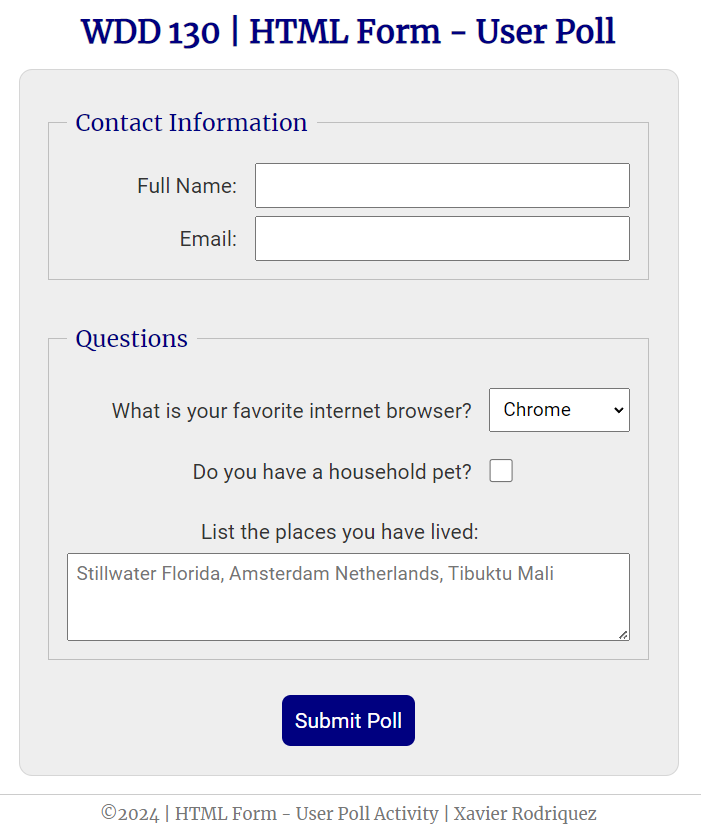
Here is an example of what you will be producing:
Setup
- In the week05 folder, create a styles folder if you have not already.
- Add a poll-form.css file in the styles folder.
- Open the poll-form.html file in the week05 folder.
- Add the reference link to the CSS file.
- Start the Five Server localhost browser service so that you can watch changes unfold as you add style.
Add Style
You are encouraged to design and style the form on your own versus copying the example. The example is provided to give you an idea of what you are aiming for. You will learn more by doing it yourself.
- Add a font(s) of your choice using the font-family declaration.
- Style the universal selector
*rule to set the defaultmarginto zero,paddingto zero, and thebox-sizingtoborder-box.Example
* { margin: 0; padding: 0; box-sizing: border-box; } - Style the body rule to declare the
font-familyand whatever else you deem necessaryExample
body { font-family: Merriweather, Georgia, serif; font-size: 1.2em; color: #333; background: #fff; } - Style the
headerandh1as you see fit.Example
header { margin: 0 auto; width: 650px; } h1 { margin: 1rem; font-size: 1.5em; color: navy; text-align: center; } - Style the
formwith awidth, a centeredmargin,padding,border,border-radius,background-color, and adisplaylayout of grid.Example
form { width: 650px; margin: 0 auto; padding: 1rem; border: 1px solid rgb(0 0 0 / 0.1); border-radius: 0.5rem; background-color: #eee; display: grid; } - Style each
fieldsetto be agridand provide agapand whatever else you deem necessary.Example
fieldset { display: grid; gap: .5rem; margin: 1rem; border: 1px solid rgb(0 0 0 / 0.2); padding: 1rem; } - Style the fieldset
legend.Example
legend { padding: 0.5rem; color: navy; font-size: 1.3em; } - Option: Style all the form elements (
label,input,button,select, andtextarea) with a different font family and in whatever other way you see fit that is different than the headings and legends.Example
label, input, button, select, textarea { font-family: Roboto, Arial, sans-serif; } - Style the
labelelements totext-alignright and have apadding-rightvalue.Example
label { text-align: right; padding-right: 1rem; } - Style the
input,select, andtextareaelements to havepaddingand a largerfont-size. Note that this is critical in order to provide spacing inside of the form input elements.Example
input, select, textarea { padding: 0.5rem; font-size: 1.1rem; } - Style the checkbox input element to be larger than the default size using
widthandheight. Change thevertical-aligntobottomto properly align it within its space.The best practice CSS selector for this isinput[type="checkbox"]Example
input[type="checkbox"] { width: 22px; height: 22px; vertical-align: bottom; } - Style the
buttonas you see fit along with thebutton:hoverpseudo-class.Example
button { margin: 1rem; background-color: navy; color: #fff; border: none; border-radius: .5rem; padding: .75rem; font-size: 1.2rem; } button:hover { background-color: darkgreen; } - Style the
footerExample
footer {
  margin: 1rem auto 0;
  width: 650px;
  text-align: center;
  font-size: 0.8em;
  color: #777;
  border-top: 1px solid #ccc;
}
Add HTML Divs
- Create
div(container) elements around each form label-input/select pair in your poll-form.html document.There should be five: full name (text input), email (email input), browser (select), pet (checkbox), and places lived (textarea).
- Give each of those
divelements a class attribute namedform-item. Here is an example on the first item:<div class="form-item"> <label for="fullname">Full Name:</label> <input type="text" id="fullname" name="fullname"> </div> -
Give the fullname and email
divcontainers an additional class name ofcolumn2.<div class="form-item column2"> <label for="fullname">Full Name:</label> <input type="text" id="fullname" name="fullname"> </div> <div class="form-item column2"> <label for="useremail">Email:</label> <input type="email" id="useremail" name="useremail"> </div> - Give the select (browser options question) and checkbox (pet question)
divcontainers an additional class name ofcolumn1.
CSS Style the Class Selectors
-
Style the
.form-itemclass selector to have adisplayofgridto align the label and input/select elements. Also applyalign-items: centerfor vertical alignment in the grid layout.Example
.form-item { display: grid; align-items: center; } -
Style the
.column1class selector to have agrid-template-columnsof3fr 1frso that the first column (the label) takes three times the space of the second column (the input). Add a margin as needed to achieve the desired spacing.Example
.column1 { grid-template-columns: 3fr 1fr; margin: 0.5rem 0; } - Style the
.column2class selector to have agrid-template-columnsof1fr 2frso that the first column (the label) takes half the space as the second column. Also, add a margin as needed. You can adjust this value to get the desired spacing.Example
.column2 {
  grid-template-columns: 1fr 2fr;
}
Test and Adjust
- Be sure to review your work in the browser using Five Server.
- Add additional CSS rules and declarations as needed to get consistent spacing and uniform alignment.
Submission
- Commit and push your work to your wdd130 GitHub Pages enabled repository.