W04 Assignment: Rafting Site – Update About Us Page
Overview
Continue to work on the rafting site about.html page using the wireframe as a guide. The tasks include working on the layout and content of the header, navigation, sections, and footer.
Instructions
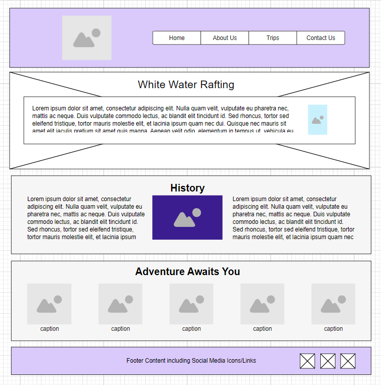
- Use this updated wireframe as a guide to enhance the layout of the about.html page.

Wireframe Design for Updated About Us Page - Open the about.html file and the rafting.css files for editing.
- Continue to make updates to the page.
- Use CSS Grid in the
headerto create the horizontal layout between the logo and the navigation bar. - Use CSS Flex to create the horizontal layout in the
nav..Help
Open the HTML file named header-layout.html in the week04 folder to review an example of using grid in the
headerand flex in thenav. - Style the
header,img, andnavas needed to create a well designed header that will also be used on the other pages of this rafting site providing a consistent look and feel across the site. - Layout the History
sectionelements as shown in the wireframe layout. - Style the Adventures
sectionwith five images to span the section horizontally using a CSS layout method. Usefigureelements to contain theimgelements and usefigcaptioncaptions for eachfigureimage, labeling them with the trip adventure name or the water rapid name, e.g., "Los Dientes del Diablo", "Big Mallard", "Half Day Adventure", etc.Help
<figure>
  <img src="images/..." alt="...">
  <figcaption>...</figcaption>
</figure>
The Figure Element – MDN
Use the image resources presented in the previous week's assignment to help you find free images to use on your page.
- Style the footer so that the three social images fit in the space and are arranged horizontally and to the right as pictured in the wireframe.
Testing
- Every page in this course will be expected to pass the development standards checklist.
- Continuously test the page in the local browser using Live/Five Server.
- Commit the changes and sync/push them to the wdd130 GitHub Pages enabled repository.
- Run this assignment's ✔ page audit tool to verify that you have the basic document content.
- Check for color contrast violations at the AA level by using the ▶️ DevTools CSS Overview tool.
- Check that the total transferred kiloBytes, page weight, does not exceed 500 kB.
Use the total transferred kB information provided by the browser's DevTools Network panel. You will want to reload the page using Empty Cache and Reload when testing in the Network panel. If the total transferred amount is greater than 500 kB, it is likely that you forgot to optimize images.
Submission
- Submit your GitHub pages URL (website address) in Canvas.
Here is the sample URL where you will substitute your GitHub username for githubusername:
https://githubusername.github.io/wdd130/wwr/about.html
