W04 Learning Activities: Using CSS Layouts
Overview
Mastering CSS Flex and Grid can be challenging. This activity highlights some of the most relevant layouts and the principles behind them.
Prepare
When do I use CSS Flex versus CSS Grid?
Depending on the desired layout, you can often make either method work. You can even use them together, such as using flex to align items within a grid item.
Choose Flex
- Simple Layouts: CSS Flex is ideal for one-dimensional layouts like navigation, or any group of items that need to be arranged side by side or stacked vertically.
- Alignment: Flex is excellent for aligning items horizontally or vertically.
- Dynamic Content: Flex is often ideal for layouts with dynamic content where item sizes may vary.
Choose Grid
- Complex Layouts: CSS Grid is generally more robust, allowing you to create two-dimensional layouts for common structures like tables, calendars, merged cells, and more.
- Fixed Width Layouts: Grid is suitable for fixed-width layouts, where item sizes are known.
- Overlap and Layering: Grid supports overlapping and the layering of the items.
Common Layout Methods
The following are common layout tasks that can be easily accomplished with Flex and Grid.
Aligning Items in a column
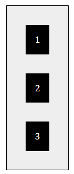
To align items in a column, you can use Flex, and set flex-direction: column; (row
is default).
display: flex;
flex-direction: column;
Centering Vertically and Horizontally
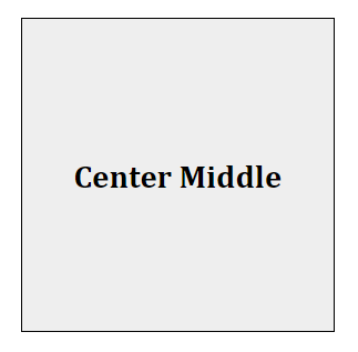
The following code centers the child item both horizontally and vertically using CSS Grid. This code is applied to the parent grid container.
display: grid;
place-items: center;
Centering can also be accomplished with the following code for both Flex and Grid:
display: flex; /* or grid */
justify-content: center;
align-items: center;
Activity Instructions
- In the week04 folder, open the file named layout-exercises.html and open layout-exercises.css in the styles subfolder within week04.
- Use Live/Five Server to open the file in the browser.
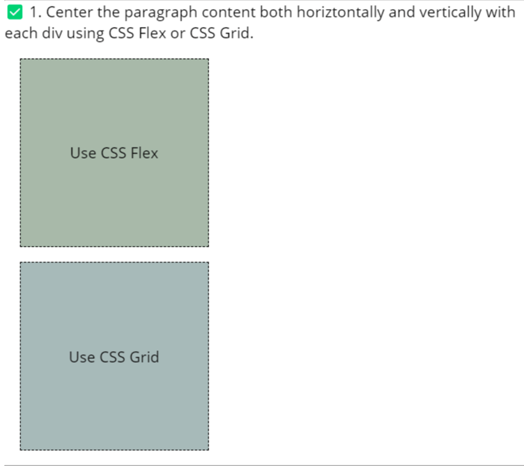
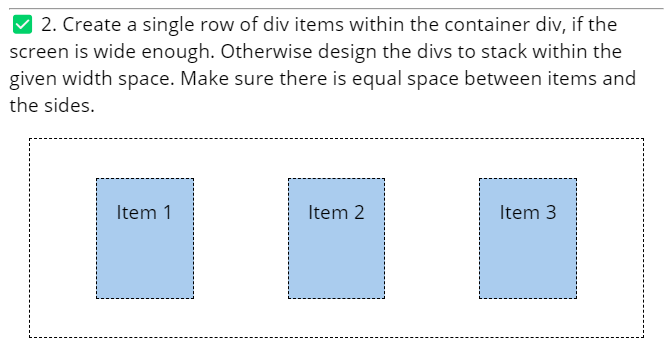
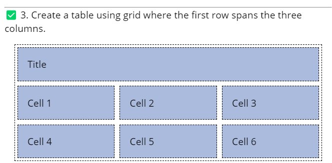
- Complete the three exercises contained in that file. The following images show what the solution should look
like:
Check Your Understanding
Attempt to complete the exercises on your own before looking at this example solution.
-
.flex {
  background-color: #aba;
  display: flex;
  justify-content: center;
  align-items: center;
}
.grid { background-color: #abb; display: grid; place-items: center; }* Either
place-itemsoralign-items/justify-contentcan be used for this exercise. -
.container2 { display: flex; flex-wrap: wrap; justify-content: space-around; } -
.container3 {
  display: grid;
  grid-template-columns: 1fr 1fr 1fr;  /* or grid-template-columns: repeat(3, 1fr); */
}

.columns-3 {
  grid-column: 1/4; /* or grid-column: span 3; */
}
There are also solution files named layout-exercises-solutions.html and layout-exercises-solutions.css in the week04 folder for reference.