
W04 Learning Activity: CSS Grid
Overview
CSS Grid Layout is a two-dimensional layout system for the web that allows you to arrange content in rows and columns. It includes many features that make building complex layouts straightforward. The goal of this activity is for you to understand the basic features of CSS Grid and how to use them to create layouts.
Prepare
Think of CSS Grid as drawing invisible lines on your webpage to create rows and columns, similar to how you might organize content in a table or spreadsheet.
Please watch the following videos that introduce CSS Grid:
▶️ Grid Layout (Part 1 of 2) (7:15 minutes, 📄 Transcript)
▶️ Grid Layout (Part 2 of 2) (5:59 minutes, 📄 Transcript)
Creating a Grid Layout
As shown in the videos, to create a CSS Grid layout, you need to apply certain properties to the grid container, which is the parent element that holds all your grid items. Then, the immediate children of that parent container will respond to grid declarations (but grandchildren will not).
The most common grid properties are:
- display: grid – Turns an element into a grid container
- grid-template-columns – Defines the number and size of columns
- grid-template-rows – Defines the number and size of rows
- gap – Sets the space between grid items
Defining Columns and Rows
The grid-template-columns and grid-template-rows properties allow you to specify exactly how your grid should be structured. You can use different units to control sizing, such as pixels (px), percentages (%), or the flexible fr unit.
Common ways to define grid tracks:
- Fixed sizes – Use pixels for exact measurements:
200px 150px 100px - Flexible sizes – Use
frunits to share available space:1fr 2fr 1fr - Mixed sizes – Combine different units:
200px 1fr 100px - Repeat function – Use
repeat()for repeated patterns:repeat(3, 1fr)
The following example creates a grid with three equal-width columns and a gap between the items. The second rule makes one item span the first two columns.
.gallery {
  display: grid;
  grid-template-columns: repeat(3, 1fr);
  gap: 1rem;
}

.wide {
  grid-column: 1 / 3;
}
Activity Instructions
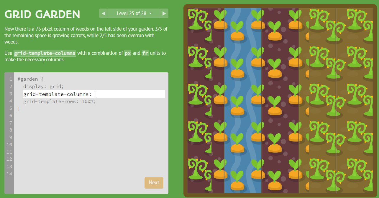
- Complete this 28-level tutorial on CSS Grid: Grid Garden.
Optional Resources
- CSS grid Property – MDN
- Grids – MDN