
Assignment 1
Purpose
This assignment is a review of the concepts, skills and techniques that should have been learned in previous Web Frontend Development course(s). It requires you to apply these previous skills to work with the documents and processes from the activities, for a fictitious car dealership - CSE Motors.
When done, you will have:
- Altered the existing index.ejs view and the existing partial files as needed to provide a home view for the car dealership.
- The resulting page will meet the standards shown in the Frontend Checklist.
- The page will use EJS partials for the head, header, navigation, and footer.
- The index page will include the content shown in the sample images (mobile and large screens).
Notice!
All code must be your own. No outside templates, frameworks, code copied from the Internet, or another individual are acceptable for this assignment or future assignments in the course. Submission of work which violates this standard will result in a zero for the assignment and referral to the standards' office for disciplinary action.
Video Overview
This video provides a brief demonstration of what your finished assignment should look like and how it should behave once done. This is the Transcript of the video.
Assumptions
This enhancement assumes that you can code semantic and valid HTML5, CSS3 (including the use of media queries and responsive layouts) and implement basic usability concepts. The resource materials listed at the top of this document are meant to help brush up with these skills as needed.
Downloads
The starter folder that you downloaded and implemented earlier contains the images and static folders needed. It is assumed that the routes, EJS layout and partials are fully operational from completing the activities.
Tasks
Build the CSE Motors Home View
Modify the existing index.ejs file and partials as needed to produce the CSE Motors home view. The view must contain the content as shown in the images below:
-
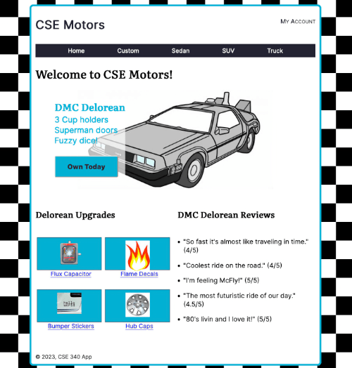
CSE Motors home - Large Screen 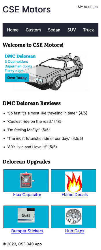
CSE Motors home - Mobile Screen - The content images (shown in the pictures) are found in the public > images folder.
- Write and implement CSS to position the page content to match as closely as possible the provided images for both large screen and mobile screen layouts.
- Include the
media="screen"attribute for the CSS link element, - Use a color scheme of your own choosing. However, selected colors must pass accessibility contrast checks with no errors.
- Use fonts of your choice, but they should provide a professional, easy to read, look and feel.
- Be fully responsive to a variety of devices so that the content loads without horizontal scrolling or zooming (see the video illustration below),
- Meet usability standards as checked using the WAVE browser extension. No accessibility or contrast errors should be present.
- Use external CSS for all styling. The CSS must:
- be stored in the provided public > css folder,
- start with a mobile first approach (this means that CSS for mobile devices is outside media queries),
- be responsive to varying screen sizes of a variety of devices,
- use media queries for responsive layout only for larger screen sizes (don't go overboard here, limit the number of media queries to one or two - but remember that CSS inside media queries adjusts styles for larger devices),
- be of your own writing.
- be valid HTML5 and CSS3 code.
Submission
- Build and test your code using the Express server development environment.
- Work with your learning team to accomplish the task and post to and read the weekly discussion board to help one another.
- Check your work to ensure that it meets all the expectations listed.
- When satisfied that the code is operational:
- Upload the project to your GitHub repository.
- Go to the render.com dashboard and manually deploy to your web service.
- Thoroughly test the application in the browser on the production server following deployment.
- Fix any and all errors prior to submission.
- Submit the render.com production URL AND the GitHub repository URL as a comment in the assignment submission.
Resources
Here are resources that may be helpful to you as you complete this assignment.
- Install and check usability of web pages using the WAVE Browser Extension from WebAIM
- Accessibility Fundamentals Video
- Install and Use the Web Developer Extension
- Review HTML Semantic Structures
- Review HTML Syntax
- Review the viewport meta element
- Review Validating Local HTML and CSS(05:44 mins, "Validating Local HTML and CSS" Transcript)
- Review DevDocs.io, specifically:
- Using Flexbox for Responsive Layout
Grading Matrix
Use the grading items below to pre-grade your work as these are the grading items the professor will use to grade the work.
Objective 1
- The home view is styled with fonts and color scheme that are professional and easy to read.
- The home view is shown meeting the standards shown in the Frontend Checklist.
- Obj. 1 value: Refer to grade book
Objective 2
- The home view is fully operational and delivered using the index route.
- The layout and partial files are delivered successfully, along with the content, to render the complete home view.
- Obj. 2 value: Refer to grade book
Objective 6
- The render.com production URL and the GitHub repository URL are both submitted on time and correctly. Both URL's must be present and operational for the assignment to be graded.
- Obj. 6 value: Refer to grade book