
Image Aspect Ratio
Overview
The aspect ratio of an image is the proportional relationship between its width and its height. It is commonly expressed as two numbers separated by a colon, as in 16:9. For example, a 16:9 aspect ratio means that for every 16 pixels of width, there are 9 pixels of height.
When you work with images on the web, consider the aspect ratio of each image. In a responsive design, the image must scale properly as the viewport changes size. If the aspect ratio is not preserved, the image may become distorted or cropped in an undesirable way.
Issues
Aspect ratio is one of the checks in the Best Practices category of a Lighthouse audit.
Reference: 📑 Displays images with incorrect aspect ratio – Chrome for Developers
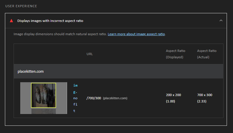
Here is an example Lighthouse report from DevTools where an image is displayed with an incorrect aspect ratio.
How to Fix
There are a few ways to fix an incorrect aspect ratio issue:
- Use the
widthandheightattributes on the<img>element to specify dimensions that match the intrinsic (actual) dimensions of the image, and let CSS scale it withheight: auto. The attributes also let the browser reserve space for the image before it loads, which prevents the layout from shifting.<img src="images/castle.webp" alt="Castle Eltz in Germany" width="800" height="450">img { max-width: 100%; height: auto; } - Use the CSS
aspect-ratioproperty to define the desired ratio, e.g.,16 / 9. Choose a ratio that matches the content of the image, or combine it withobject-fitso the image is cropped rather than stretched.img { width: 100%; aspect-ratio: 16 / 9; /* Adjust this ratio as needed */ object-fit: cover; /* Crop instead of distorting */ } - Use the
object-fitproperty to specify how the contents of the<img>element should be resized to fit its container.Example using
object-fit– CodePen ☼ object-fit